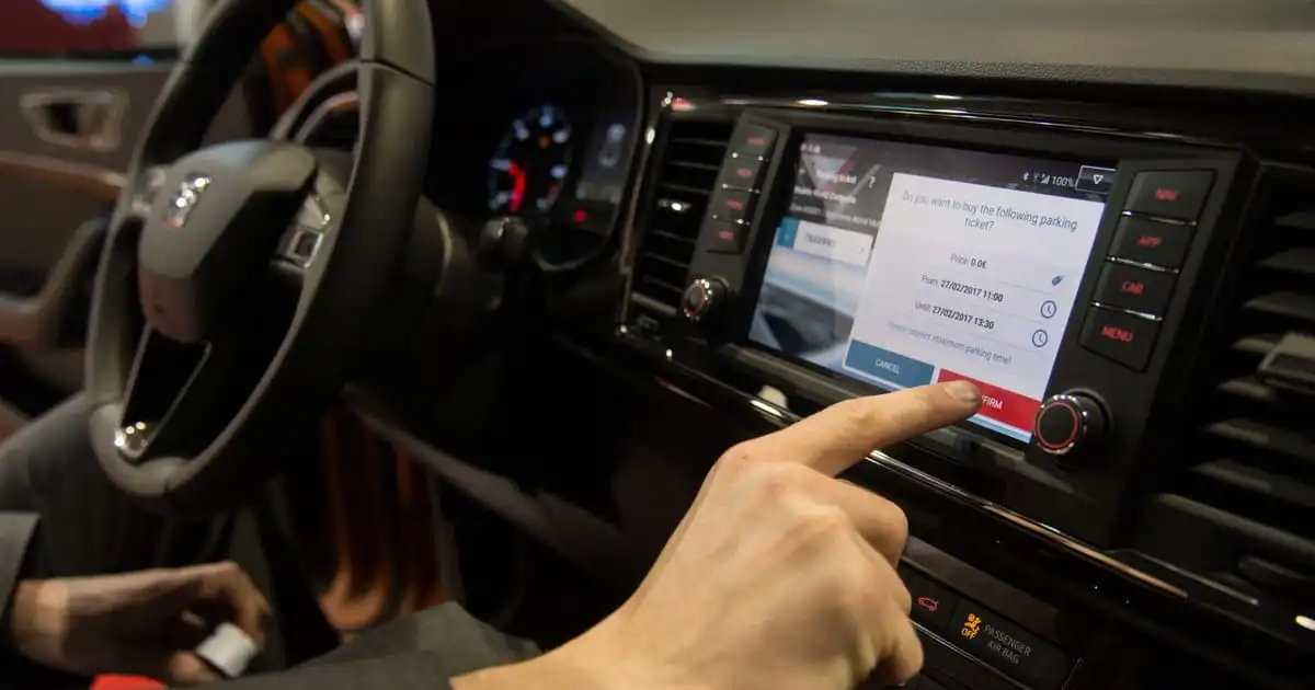
Good! Fuck those screens!
I want to have the fucking windshield spray on my fucking steering wheel again! Why the hell did anyone think putting these things behind 20 menus is a good idea?!?
It seems you’re being distracted from reading the article correctly…
…its horn, windshield wipers, turn signals, hazard warning lights and SOS features…
Windshield spray is not an essential control…
It still belongs on the fucking steering wheel. You could say its part of the windshield wipers.
Curious which vehicle doesn’t have it there. Even a model 3 has both on the left stock button.
windshield spray
Wait, did that disappear? Sorry, I’m a bit out of the loop, the last few cars I had still had it
A car i drove at work had the fucking windshield spray in a sub menu yes. Idk what car it was, my company sold it after a month because we all agreed that its a safety hazard. I know it was a EV however. Maybe a Tesla or something like that.
Tesla you just push a button on the stick like any other car. What monster puts that only behind a submenu
deleted by creator
I remember the first time I saw a Tesla interior and just couldn’t understand why the hell they moved the speedometer (and every other piece of critical information) out of your line of sight.
We have completely added a shitton of inconvenience and confusion to car interiors. This is what my dash looks like in a 2003:

This and my radio are literally all I need to operate my vehicle. The idea of having screens and any extra information just bothers me. We’re hurtling 2+ ton boxes of death along highways and neighborhoods. They should be treated like construction equipment. They shouldn’t be entertainment first. You shouldn’t be fully relaxed and unaware of your surroundings.
And you certainly shouldn’t feel like the car has your back. The way modern safety features lull you into a false sense of security is honestly one of the worst ideas yet. If you’re convinced the car will always protect you with 287 “automatic” safety features, you’ll be convinced you don’t have to pay attention anymore.
When did cars become living rooms with wheels?
They should be treated like construction equipment.
You haven’t been in modern construction equipment. They are even more touch screens than any car. They are also a lot more automated - in some cases the only purpose of the operator is to watch for kids running into the construction site and hitting the emergency stop. (the operator because he is there is watching the screens as well, but the only thing that couldn’t technically be done from an office given a good network connection is watching for safety issues)
I honestly shouldn’t even be surprised. I know that 80% of the reason everything is a screen is cost. If you just slap a screen in the center console, all of your controls are done. Now it’s just software development that’s already been mostly done on the previous model and can be copy-pasted. No more engineering physical dials and buttons in a logical layout. Plus, it can always be fixed in an update right? They certainly wouldn’t think of making the feature set worse or more distracting with future versions… right?
The display on construction equipment is showing the “blueprint” of what the site should look like when done, something that cannot be done with individual switches. The machine is then driving the correct path (using GPS) to make the site look like the blueprint. This is similar to self driving, except that they don’t pretend they are safe to operate on public streets.
Good. Having a diversion-o-matic in the center console hurtling along at 100+ km/h in tons of metal is just a patently bad idea anyway.
Yes, buttons / switches for the basic driving things is what we need. Leave the touchscreen controls for aa/carplay stuff. Also don’t kill aa/carplay please.


