
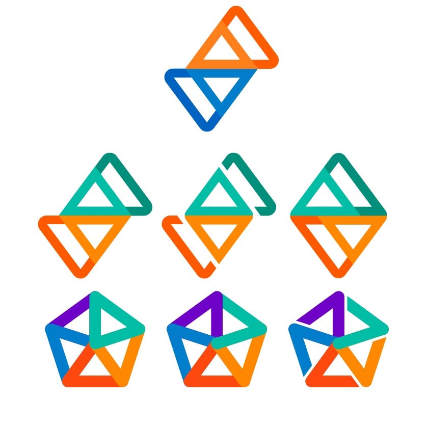
These are my takes on alternate Sync logos for Lemmy (I made that rat from a while ago)
The logo for Sync is so tied to Reddit for me personally, that it was hard to think of ways to translate it to Lemmy (or the Fediverse overall).
Orange and Blue are signature colours for Reddit, but Lemmy doesnt necessarily have a colour scheme. Nor should it. that’s up to the instance operators to choose, making their community unique.
I also like the general Fediverse pentagon logo, but it can look quite busy…
I did what I could. I’m an average designer at best ¯_(ツ)_/¯
You must log in or register to comment.
Uh, ignore the pride-themed swaztika with an extra arm
😂 I actually like it 😭
do you want to become an artist aswell?
Follow-up question: what are your thoughts on respecting the sovereign borders of Poland?
poland? what poland? all i see is Lebensraum
The propoganda poster were designed in Illustrator
They already are!
LGBTQanon logo
The current version with reversed colors, is all that’s needed. I wouldn’t change it beyond that.
I thought that too, that makes the most sense honestly.
I just thought it’d be fun to fiddle with the logo
Either this or the green and orange one in my opinion. No separations, no pentagrams is my vote.
I like the middle Fediverse logo. The bottom right one is a little swastika-y.
I’m happy to know it’s not just me. Everything else was fine (non-sync user, grain of salt), but I feel breaking up the lines breaks up the middle image in a way that’s more confusing to read, and the bottom right is a bit uncomfortable.
Just wanna add that I didn’t see it as swastika until it I read the comments. I still don’t.
Why not just keep the original one? There’s no reason for people to keep the Reddit app installed anymore
The best is still the original, but with colors swapped. AKA, the current logo
Middle middle or middle left. Still has the Sync vibe with a new spin.
Same.
Either just swapped color and the same shape. (Middle left)
Or those bit distinct triangles remind me the ears of the lemmy logo. (Middle middle)
Middle middle. Simple and elegant. The fediverse looks great but might be a pain. If it isn’t, I say bottom right.
Middle left, if it’s to similar with just the color change then go middle right. Middle right has a clean simple look and good symmetry.
Middle middle is my favorite after the original.
I like the middle left and bottom right.
Now I can’t unsee it after someone says it looks like a guy walking
Bottom right is cool in a vacuum, but there’s like… a shade of swastika to it? I dunno, maybe that’s just extremely online of me, but I’d be a little hesitant on it for that reason as compared to middle bottom.
The one that strikes my fancy the most is middle right., maybe just because it reminds me a little bit of Strava. Maybe the Fediverse colors could be applied to that one in some way, maybe teal and blue on top, red and orange on bottom, and purple as a fill? Or blue and purple on top with teal as a fill. In my head that looks cool, but in practice it might look like total ass. Worth trying anyway imo.
Yeah, hard swastika vibes on bottom right. Some groups use a different count of legs to look similar but also avoid laws against it.
Middle is cleanest, the separation of the top right and bottom left elements makes it very readable.
Also, separates itself from the reddit one.
Middle Left I think is the best most coherent
It’s also more obvious that it’s constructed from the arrows of the original logo, compared to the middle bottom one that’s more overlapping/intertwining.
It was either focus on the arrow motif or Fediverse symbolism.
These look really great. Well done on iterating while still keeping the “sync feel”. I think the default logo should stay the reversed colours of the sync for Reddit logo but I would love to see some of these as alternate icons!
Only little note is that the bottom left should have 1 more purple leg (the one going straight up should be purple).
Re: your note, your change would make it the same as the middle. I think it’s meant to show overlap with the green being the first layer.
I’m really not sure how I missed that. I’ll leave my original comment as is but you’re definitely right.
Rat is top option. Any from the middle row, but I’m partial to the center one
Burn the bottom row.
Ooo I like these ones, they remind me of sync without being a direct copy. Really nice concepts


