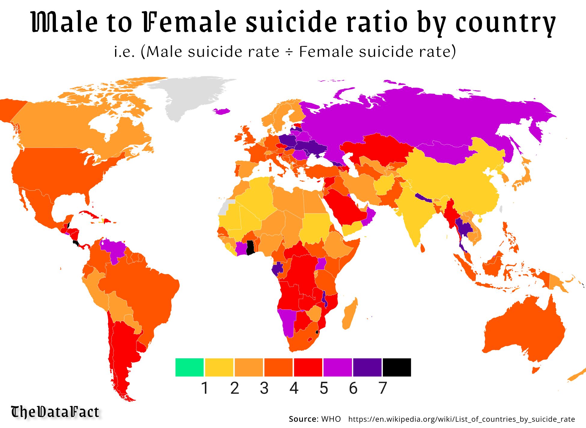
Pretty sure green would be male/female suicide parity (for every man to commit suicide, there would be a woman as well). I’m pretty sure the scale indicates more men than women commit suicide the further up you go. That being said, it is not a very good graph, and also doesn’t show total numbers, which would be interesting to see.


Pretty sure green would be male/female suicide parity (for every man to commit suicide, there would be a woman as well). I’m pretty sure the scale indicates more men than women commit suicide the further up you go. That being said, it is not a very good graph, and also doesn’t show total numbers, which would be interesting to see.
I’m pretty sure that green goes from 0 to 1, i.e. from 0 male suicides to suicide parity.
That would be correct. There are clearer ways that the data could have been displayed
Yeah the graph is pretty bad. I had to actually think about it and still got it wrong.
deleted by creator