

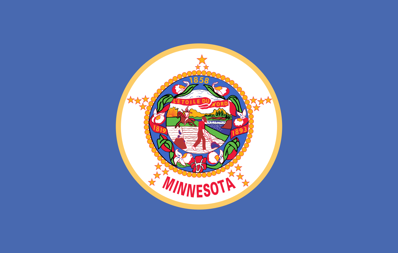
The current flag looks like this, which obviously needs changing:
There is a commission tasked with proposing a new design. A news article about it is available here: https://www.cbsnews.com/minnesota/news/minnesota-house-bill-moves-forward-commission-to-redesign-state-flag-and-seal/
The top proposal, called “The North Star Flag”, seems to be a popular favorite.
I gathered these proposals from these two sites: https://newmnflag.org/designs https://vexillology.fandom.com/wiki/Minnesota
Why does it obviously need changing? The new design will be talked about for like aonth…people will love it and hate it, then no one will care again.
Every state whose flag is just the state seal over a blue or white background should be forced to change their flag. The concept is offensively boring.
I agree, but the same should be true for yellow and green.
Really, just don’t put your seal on your flag!
And caring about a picture on cloth isn’t?
Especially one that only locals see.
Does lemmy have a version of lost redditors? Because you are in the wrong sub.
As someone who lives in Maryland, the marketability is a big deal. Our flag is on everything … and it sells.
Because it’s ugly
Visual aesthetics aside, in the Seal of Minnesota (the busy bit in the center, which has official uses besides the flag), the native on horseback is riding off into the sunset (westward, the 1983 edit notwithstanding) in the most gerenous interpretation or being driven off by the settler in a less charitable one (see rifle in the foreground). Regardless, the message is one of displacement of the native peoples by the mostly European-heritage settlers for the sake of “civilization”. It’s not something we should display proudly as an embodiment of our state’s core values, and for that reason has been contentious for years.
Some reading if anyone is more interested in the history: #1 and #2
Beats me, its got five star-cocks surrounding the seal.