'Privacy. That’s Apple,’ the slogan proclaims. New research from Aalto University in Finland begs to differ.
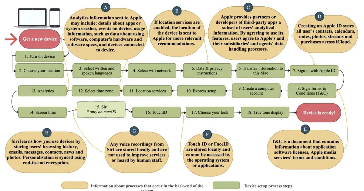
The researchers studied eight default apps, the ones that are pretty much unavoidable on a new device, be it a computer, tablet or mobile phone: Safari, Siri, Family Sharing, iMessage, FaceTime, Location Services, Find My and Touch ID. They collected all publicly available privacy-related information on these apps, from technical documentation to privacy policies and user manuals.
'Due to the way the user interface is designed, users don’t know what is going on. For example, the user is given the option to enable or not enable Siri, Apple’s virtual assistant. But enabling only refers to whether you use Siri’s voice control. Siri collects data in the background from other apps you use, regardless of your choice, unless you understand how to go into the settings and specifically change that,’ says Associate Professor Janne Lindqvist, head of the computer science department at Aalto.
'The online instructions for restricting data access are very complex and confusing, and the steps required are scattered in different places. There’s no clear direction on whether to go to the app settings, the central settings – or even both,’ says Amel Bourdoucen, a doctoral researcher at Aalto.
In addition, the instructions didn’t list all the necessary steps or explain how collected data is processed.
The researchers also demonstrated these problems experimentally. They interviewed users and asked them to try changing the settings.
‘It turned out that the participants weren’t able to prevent any of the apps from sharing their data with other applications or the service provider,’ Bourdoucen says.


This is Apple that pride themselves on UX as you mention. They mainstreamed opinionated design. If they do it a certain way there is a reason, which is not always with the user’s interests in mind. It’s not because Bob in development couldn’t think of a better way. Other brands might get away with that excuse but not Apple.