So I have a bunch of different color versions of one drawing and I can’t choose which is the best. hexbears please give me your opinions.
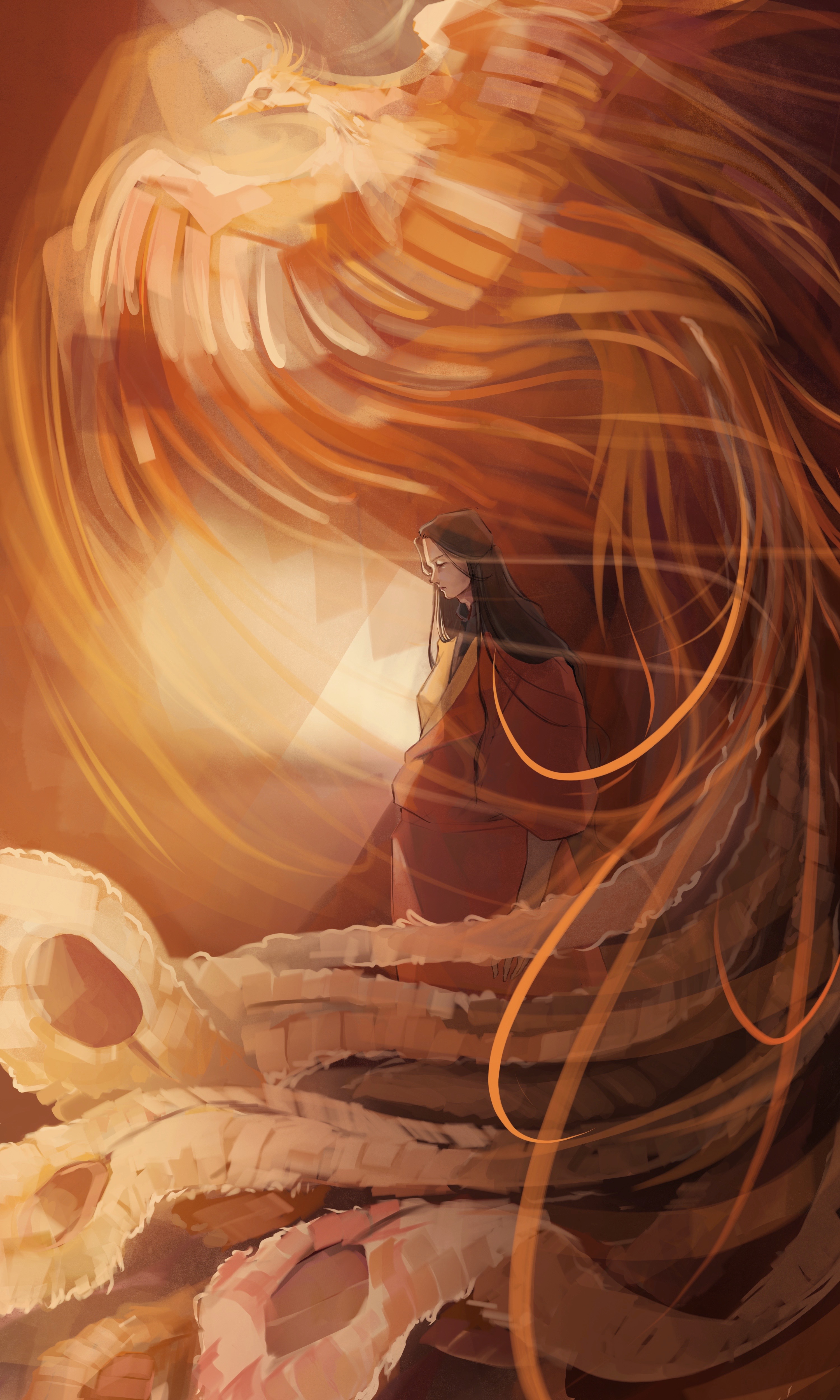

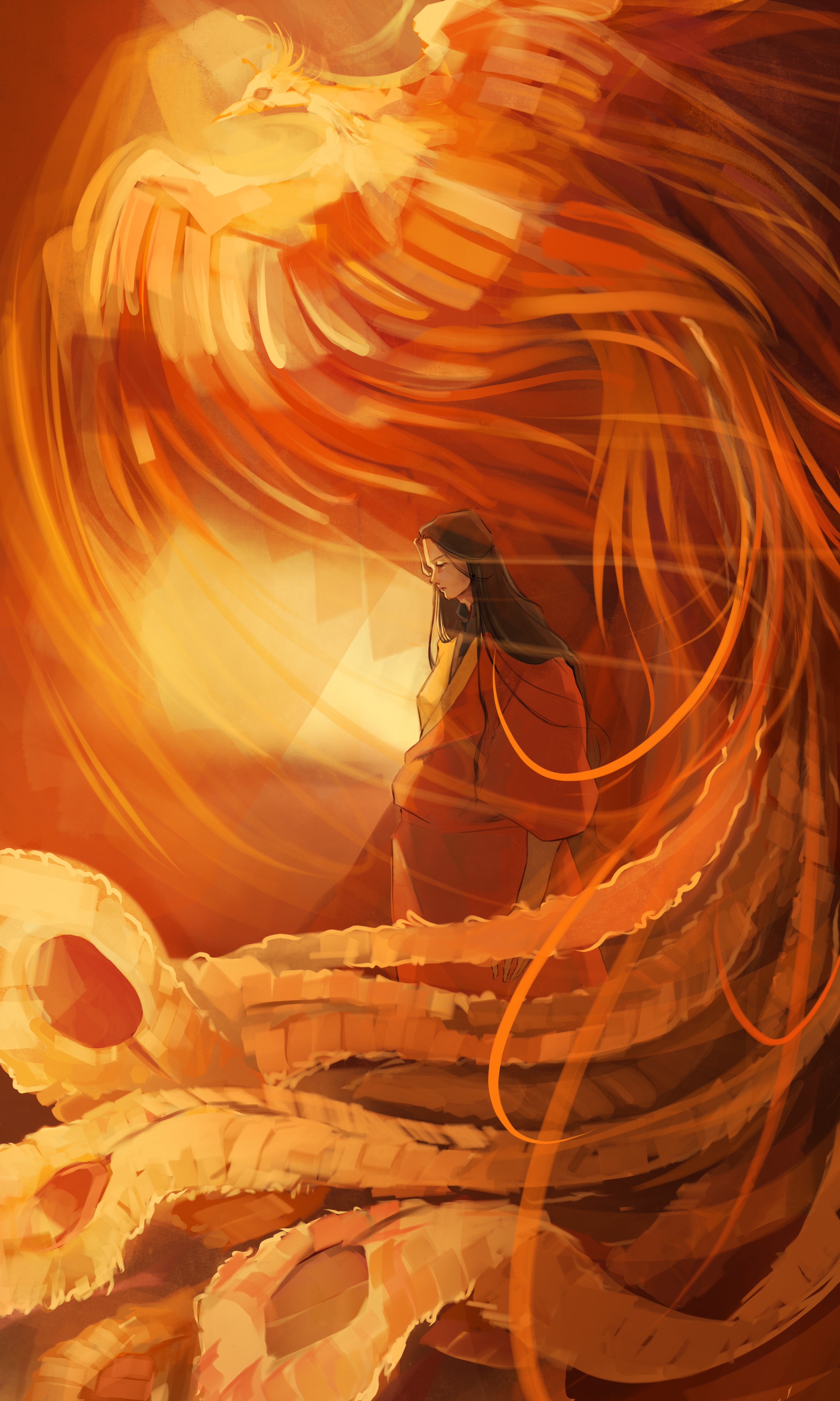

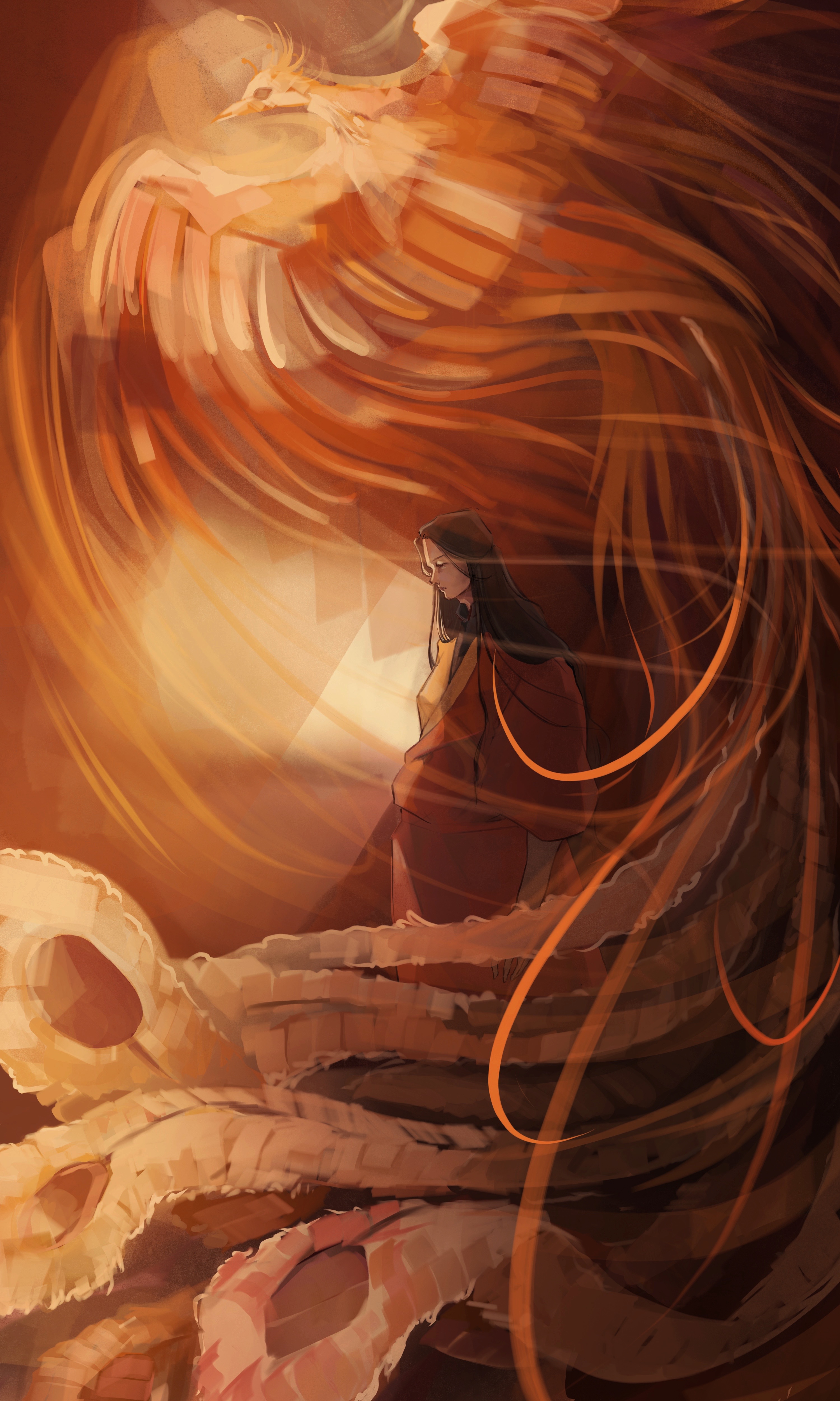
[IDs: 5 different color versions of one drawing. The drawing shows a young man with long hair, wearing an orange and yellow hanfu; and a Chinese phoenix swirling up besides him. /end ID]
Of the ones presented, 2… But I think having the high saturation around the man/center of the piece and lower on the phoenix (so man and background 2, phoenix closer to how you have it in 1) will help most of these in general. The natural value of a hue will have the most saturation, but the closer you get to white and black the more saturation of a hue will be condensed as indistinguishable—so to blow out the pheonix, go with more desaturated lights instead of super-saturated color.
Looking good.
Personal Opinion:
- looks like it has a filter on which flattens the image
- a lot of people will be drawn to the saturation. It’s my second favorite but I think the foreground colors are all fighting for your attention and it’s rather busy.
- same “filter” effect as 1
- same “filter” effect as 1
- I like the contast of light and shadow on this one, which gives an effect like burning embers. The bright parts of the tail especially stand out more and look as though they’re producing their own light. The man being more in shadow also creates some depth where he appears to actually be under the phoenix and it’s easier to focus on him.
If you have the time/energy, it might help to mix elements of 2 and 5. Some strategically placed shadows/desaturation would help the saturated parts glow even more and create depth.
I would choose 5 as well. The background light source also has more clear directionality by first illuminating the character and then the wisps on the phoenix’s. With the other opinions, the light source appears more diffuse and would probably not create such sharp shadows on the character.
But I do enjoy palette of the more saturated renderings of the phoenix, especially 2. Maybe take some of that vibrancy from the lighter portions of the phoenix’s wings in option 2 and apply it to option 5? Then you won’t have to articulate a competing light source on the character, though some thin rim lighting might look good anyway.
2 is the most contrast-y with decent vibrancy. It’s my favourite. 1, 3, 4 are a bit flat for me. 5 is good too, but the light from the person is brighter than the phoenix. Conversely for 2 the figure is a bit lost in the image, perhaps rework that one with some elements of 5 depending on what story you’re trying to tell? Which is the focal element, the person or the phoenix?
Preference order…
5, 4, 2, 1, 3
#5 is my top pick. Cooler color tone, the contrast between the lighter colors and the darker colors seems to stand out more to my eyes than #1, the greyer overall appearance kinda feels a bit like looking at something old painted on a wall or velum or a 80’s van or something.