

I appreciate the graphics that they post, but this one was… Bad.
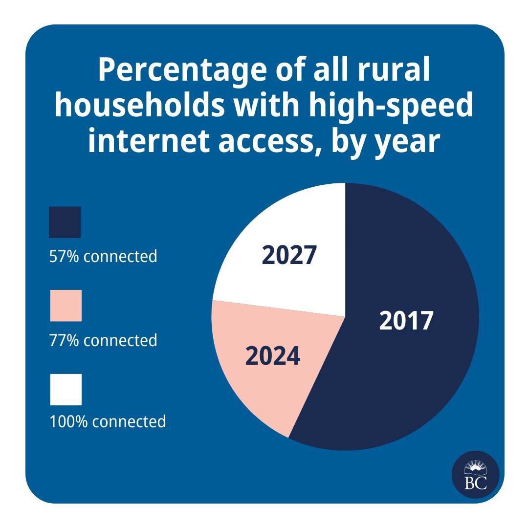
This is great news! And please also extend my deepest sympathies to whichever analyst was asked to cram this histogram into a pie chart.
They are taking the criticism in good faith though
Well, we’re taking a pie in the face on this one @[…]
We try to make info like this as clear as we can, @[…], but we don’t always get it right. Thanks for your feedback. We’re, uh, cutting ourselves a slice of humble pie.
The post: https://www.instagram.com/p/C7Pi4qAh72c/
As a designer, the conversation went like this:
Boss - I need a pie chart to show our goals!
Designer - Cool what are the percentages?
Boss - 57%, 77%, 100%
Designer - Are you sure a pie chart? Not a bar graph or anything else that shows growth?
Boss - I clearly said Pie Chart and I need it done in 15 mins!
Designer to himself - fuck whatever I don’t get paid enough for this shit anyway.
As a data analyst / engineer, I usually go through a similar journey producing those percentages.
Boss: “I need to know when we’ll reach 100% of households having high speed internet.”
Analyst: “Good morning to you too! Who has the data?”
Boss: “I thought you do?”
Analyst: “No, I’m pretty sure I haven’t seen any, uh, internet speed data in our warehouse.”
Boss: “Have you looked in the computer?”
Analyst: “… I’ll talk to Marc, he’s got his contacts with the ISPs, we’ll figure something out. What does high speed mean?”
Boss: blank stare
Analyst: “Right, I’ll talk to the Definitions Department. How should I calculate the forecast? Average over the…”
Boss: “Right, I gotta head to a meeting. You’ve got until tomorrow EoB.”
Analyst: Hectically mashes a dozen different data shapes of historical reports into a unified model, plots the progress so far, curses, tosses some generic trend formula at it because fuck trying to actually figure out the semantics