On Thursday, NASA released the first data maps from its new instrument launched to space earlier this year, which now is successfully transmitting information about major air pollutants over North America.
Does it? Los Angeles looks worse than New York City while having less than half the people. I imagine it’s going to correlate more with amount of cars and distance cars drive.


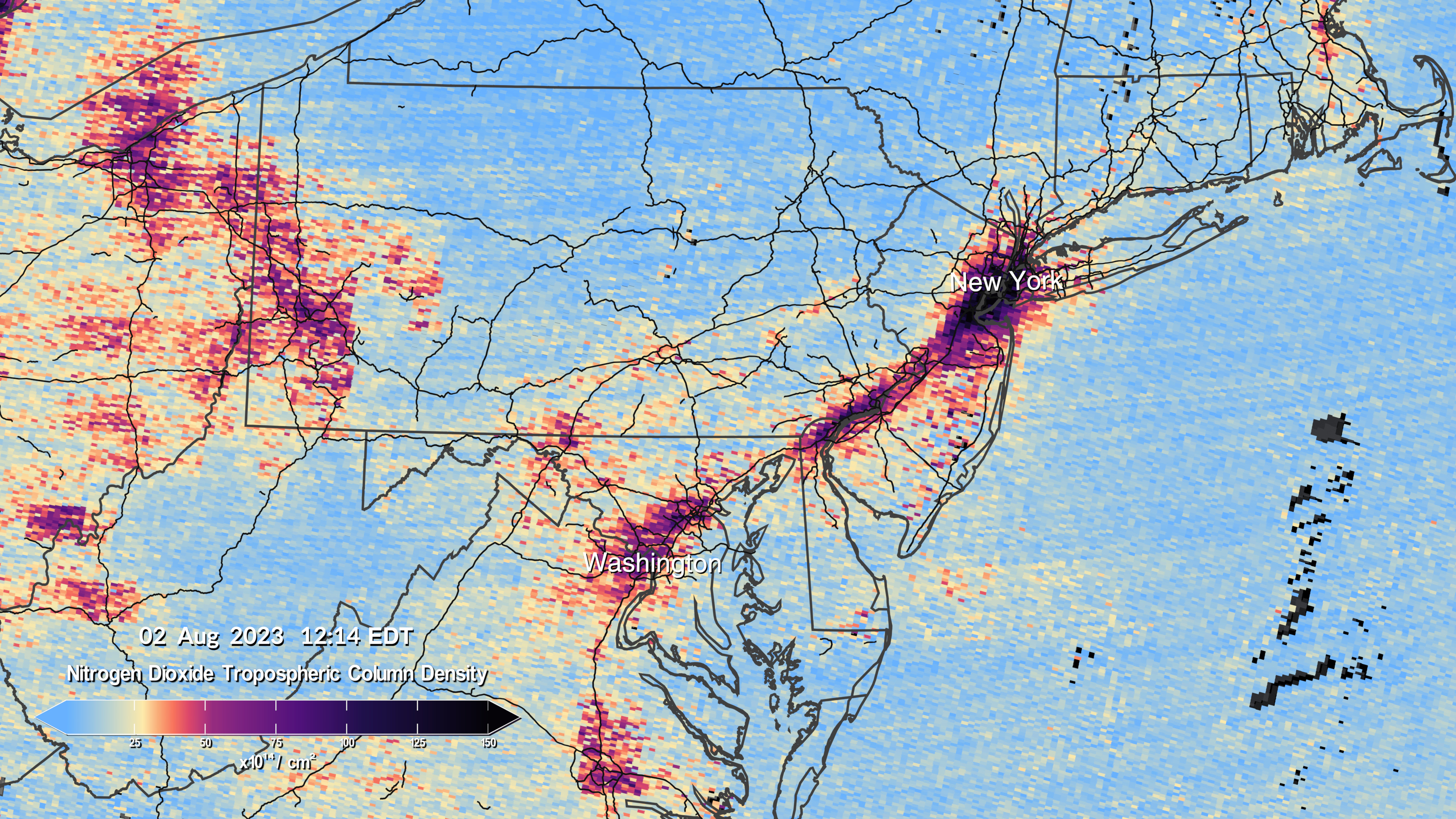
Not to be dismissive of the actual science, but this is basically a nearly 1:1 overlay of a population density map.
Does it? Los Angeles looks worse than New York City while having less than half the people. I imagine it’s going to correlate more with amount of cars and distance cars drive.