thelastaxolotl [he/him]@hexbear.net to Maps@hexbear.net · edit-24 months agoCool Chinese World Maphexbear.netexternal-linkmessage-square21fedilinkarrow-up169arrow-down10file-text
arrow-up169arrow-down1external-linkCool Chinese World Maphexbear.netthelastaxolotl [he/him]@hexbear.net to Maps@hexbear.net · edit-24 months agomessage-square21fedilinkfile-text
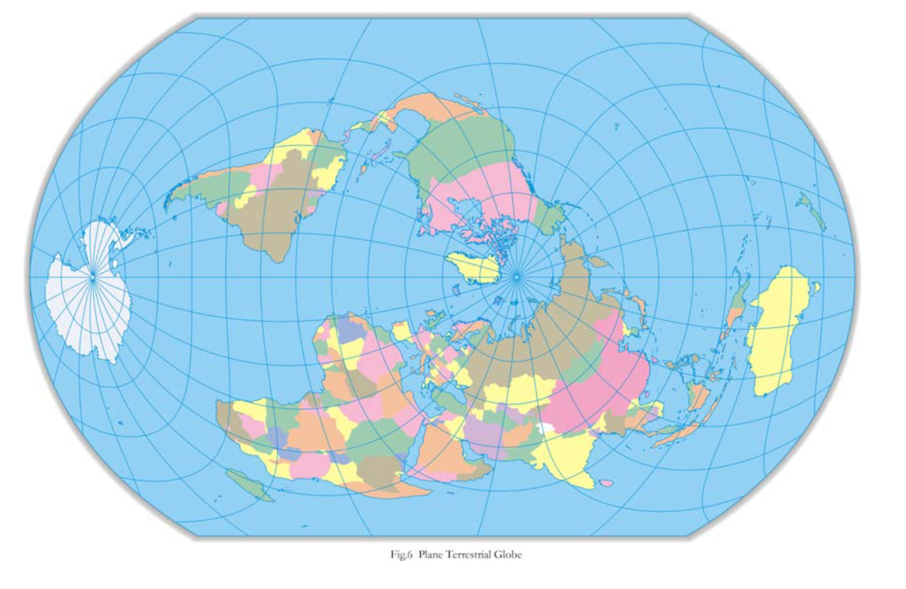
Its a Latitudinally equal-differential polyconic projection map Looks like its actually a hao proyection map
minus-squarecourier8377 [he/him, comrade/them]@hexbear.netlinkfedilinkarrow-up9·4 months agoI’m tired af but I don’t think this matches the wiki description. Love it nonetheless very cool find
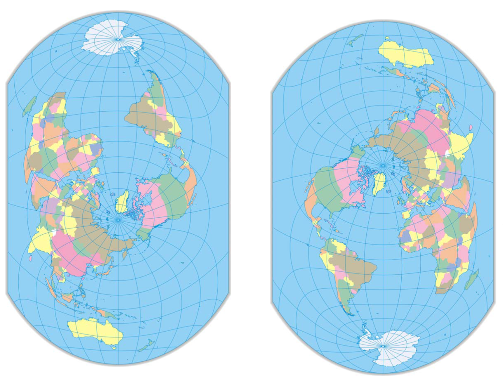
minus-squareAstroStelar [he/him]@hexbear.netlinkfedilinkEnglisharrow-up12·edit-24 months agoWikipedia mentions it here, on “List of map projections”. It has no page of its own. There’s also an alternate version in the original paper, where the Americas aren’t cut in two: I found it a while ago myself, this alternate version is one of my favourite map projections.
minus-squareAstroStelar [he/him]@hexbear.netlinkfedilinkEnglisharrow-up12·edit-24 months agoThe creator has his own website (in Chinese): http://www.hxgmap.com/
minus-squareTraschcanOfIdeology [they/them, comrade/them]@hexbear.netlinkfedilinkEnglisharrow-up10·4 months agoThis one makes much more sense, because no big landmasses are being too distorted too much, and the borders of the map are the oceans. Not to mention the center is the north pole, which makes sense as a reference point.
minus-squarepositivesoymilkworkershostel [they/them]@hexbear.netlinkfedilinkEnglisharrow-up4·4 months agoHard no. At least the first one had symmetry with north and south, north in the middle, south in the left, Australia in the right. Why???
minus-squareAstroStelar [he/him]@hexbear.netlinkfedilinkEnglisharrow-up2·4 months agoJust turn it sideways like OP’s map:
I’m tired af but I don’t think this matches the wiki description. Love it nonetheless very cool find
Wikipedia mentions it here, on “List of map projections”. It has no page of its own.
There’s also an alternate version in the original paper, where the Americas aren’t cut in two:
I found it a while ago myself, this alternate version is one of my favourite map projections.
The creator has his own website (in Chinese): http://www.hxgmap.com/
This one makes much more sense, because no big landmasses are being too distorted too much, and the borders of the map are the oceans. Not to mention the center is the north pole, which makes sense as a reference point.
Hard no. At least the first one had symmetry with north and south, north in the middle, south in the left, Australia in the right. Why???
Just turn it sideways like OP’s map: