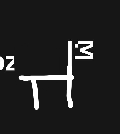
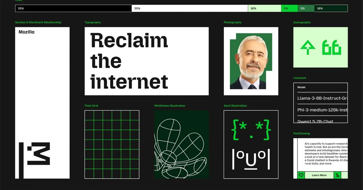
Mozilla has overhauled its branding to pay homage to its Netscape roots and better distinguish the wider organization from its Firefox web browser. The most notable change is to the company’s logo: what was previously a sans-serif wordmark styled as “Moz://a” has been updated to correctly spell out the Mozilla name, featuring a new customized typeface and an M-shaped flag.
According to Mozilla, the flag symbolizes the brand’s “activist spirit.” That fits with the image that the Mozilla Foundation, which is leading the company, is attempting to build: describing itself as “a non-profit organization that promotes openness, innovation, and participation on the Internet” and regularly releasing privacy reports that investigate tech companies’ policy and security practices.
 11·5 months ago


