
Hello everyone,
Wondering if anyone else does this. I’ve got a few colors, dark black, bright red, yellow-white, and a shade or two of orange… and everything of mine is in those colors.
All guns, all warframes, my robotic companions. All of it. It’s all done up in the same set of colors so that everything more or less matches.
I don’t bluntly apply ‘copy warframe colors’ to everything, I specifically go through and shade my gear and occasionally shift shades just a bit on some pieces or omit one of the colors, and rarely add a new one to just that piece. But essentially everything is done up in a limited set of colors.
This month I decided to dabble with the new palette on one of the frames I use frequently… I kinda like what I’ve done but I haven’t used it in missions yet. Might make some alt-coloration of my usual gear and try it out.
You must log in or register to comment.
I usually use dark grey, gold, and various shades of purple.
I am fairly boring with my colors, its typically 2 picks from smoke + maybe gold + color of my choosing.
Other than that spam random until something looks cool.
Voidshell skins get some fun additional tweaks with reflective properties so i have an all shiny black sheen with all of the teeth glowing neon green on Voruna.
I usually use black, white, and gold for the physical appearance and blue or gold with purple for energy.
Some skins don’t work well with white but usually everything works with black.
Some abilities have naturally inverted colours (Wisp for example) so I use gold and purple instead of the usual blue and purple because it otherwise doesn’t look as desired.
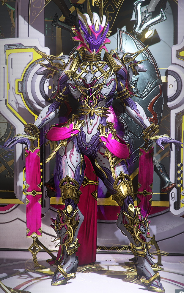
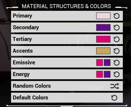
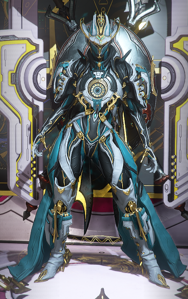
Here’s an example I made just now on Zephyr Prime.
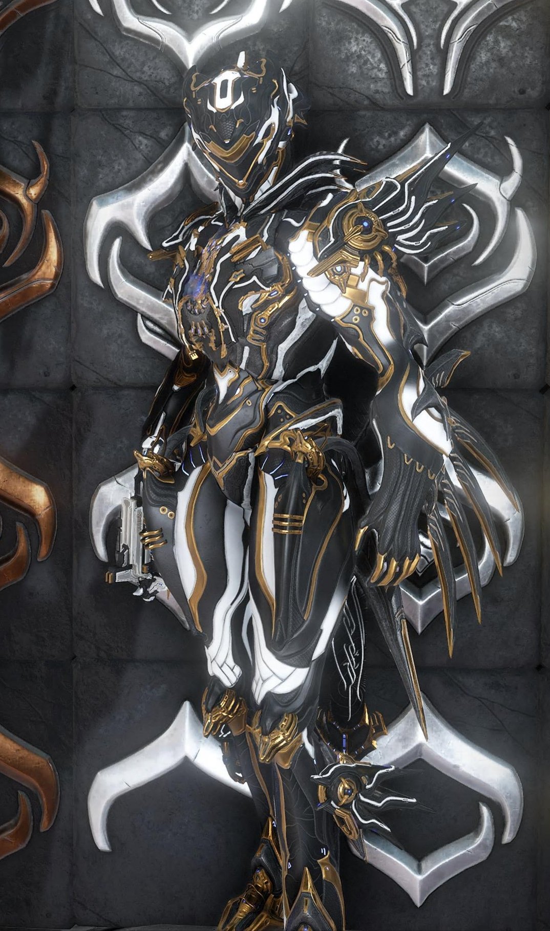
that color scheme looks so nice on Zephyr
Oh yeah, that looks good! And I see you also stack your Mastery plates for display.
Thanks! I didn’t know what to do with the plates at first because I wanted to stack them but also be able to see them often, so I decided to put them behind the Arsenal.
This is how it looks now.
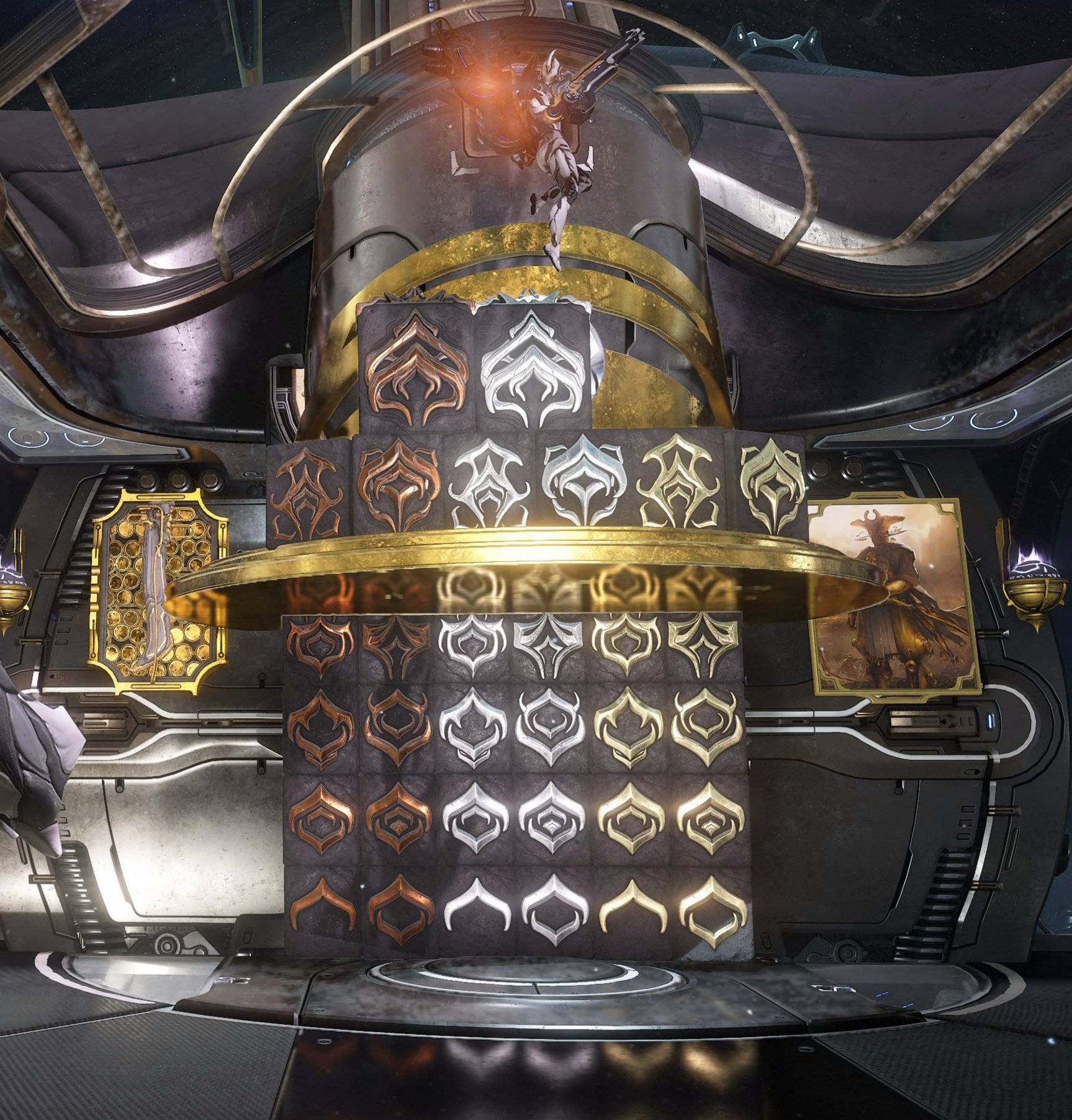
I’m waiting for Kullervo or Wisp Prime to be released to reach LR3 and finish the last missing tile on top.
Nice! I went for a slightly different take using the same elements:
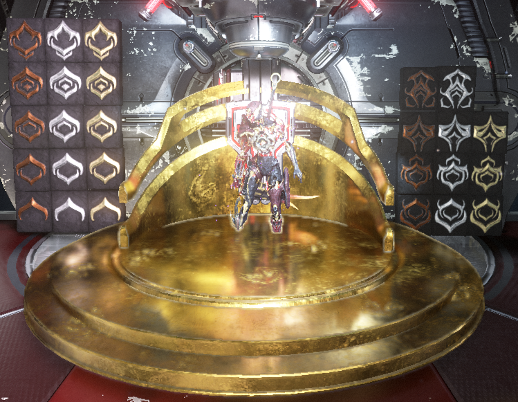
Obviously I’m not quite so far on the MR grind but I’ll have to figure out how to incorporate the LR plates once I get there.
That’s awesome! I love it!
The default look I tend to go for is a sandstone base (top row of fire pallette has some good ones for most frames) with dark and occasionally light blue from the classic pallette along with brass or bronze trim (again from regular classic). The more desaturated colors of classic works very nice for a subdued look. I feel like it gives that classic egyptian theme.
I do have several frames with other colour schemes, but I like the simplicity of the blue accented sandstone and it usually also works well with weapons for that nice cohesive look. The fact that it only uses two palettes is also quite neat if you don’t have many palettes unlocked as you could probably make do with only the fire pallette (or anything else with decent light orange/yellow) for most frames since classic middle tends to work well and it’s free.
I do have a standard set of colors I like to use but will tweak them based on the item. Plus there are set colors not part of the standard colors for special weapons to highlight the unique markings.
The bigger one is having a few set colors for the energy.
Standardization doesn’t work well for my aesthetic. It’s impossible for me to create a one-size-fits-all look because of how colors respond to materials and how the geometry can influence how the colors are perceived. There’s also a hugely varied amount of space each color can take for skins.
I pretty much have to create a palette specifically for each skin I use, but I do enjoy the variety a bunch. I don’t think I have more than a few frames share a specific color scheme.
I did random colors with the starter palette on my Volt and having been using variations of that ever since. Same idea as you where it’s an intelligent process not just a blind copy, but always the same colors or shades. Bright blue and yellow as the leads, with reds and whites as the accents depending on the frame/weapon. My friends make fun of me for it because it ends up looking very comic book superheroey and it’s a struggle with some frames but I like the themeing. Especially after the New War where it almost feels lore inspired by being my family’s original Zariman Suit colors.
But recently I’ve been scrolling through the other palette’s I’ve unlocked and barely touched and I feel almost guilty about not exploring my other options. Maybe I’ll follow your lead and try an alt-scheme. That way I can still feel like I’m themeing but I can take advantage of my new options.
Black and white, bright blue for highlights, bronze for accents. Half bright blue half pink for energy colours. I always start with that and then try to make something I like more than that for every warframe.
I’m boring, I trend towards edgy red/black/orange colorations (I just like that color scheme). In order to not make every single frame an edgeframe tho I also spam ‘randomize’ to look for cool color combinations.
I’ll usually use the base colours of Dex Excalibur, and apply that to my weapons. The colours DE used for that skin go well with almost everything.
Not quite, because each frame/skin reacts differently to different colors and also I like variety but I do have a sort of a ruleset that majority of my frames use:
- I pick a color or two I want to work with depending on the vibe I’m trying to achieve.
- the channel that covers the most area or feels like the “base” is usually a very light shade close to white or a very dark shade close to black - sometimes the second most covering channel gets same rule just reversed. Sometimes with the close to white shades I just go for a very light warm shade or very light cold shade if the color I picked doesn’t quite have this kinda thing (for example green)
- if the secondary color is not the reversed base rule, then it gets the darker one of the two colors or a darker shade of color I picked.
- the tertiary color gets a more striking, brighter color, the “pop” color.
- the metallic accent channel is usually gold (Easter C1R1 my beloved), sometimes rose gold, bronze/copper or silver. Depends on vibe I feel works best with the combo.
- energy colors are either a combo of the picked colors or something that compliments them.
And to not leave this write up without an example, here’s my Khora and my Mesa and their color schemes:
Black, the blues from the storm palette, and the very jarring pinks from the Valentine palette. Octavia is the only exception because I use the Iridos skin on her.
Patriotism [Red, white, and blue] I typically use the ‘Tenno’ and ‘Classic’ color packs since those packs are accessible to almost everyone