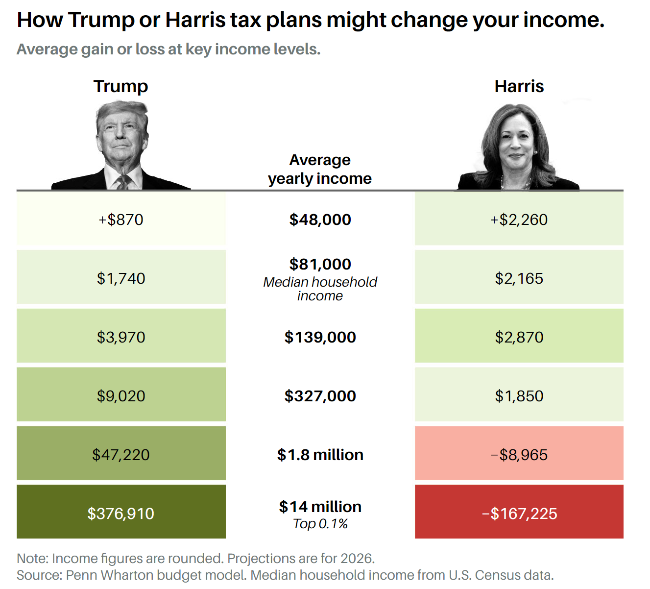
It shows how much money a person of varying income brackets would save under both parties’ tax plans. Thank you in advance.
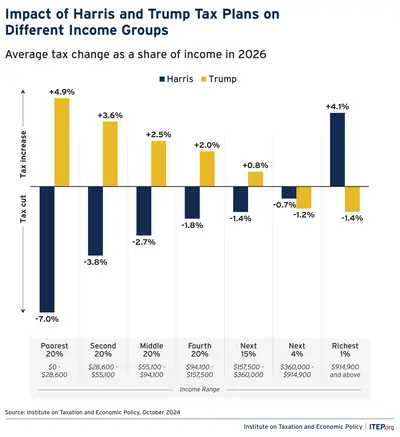
That second graph is a doozy. What is driving the two? I’m assuming the Trump plan involves a cut to capital gains tax?
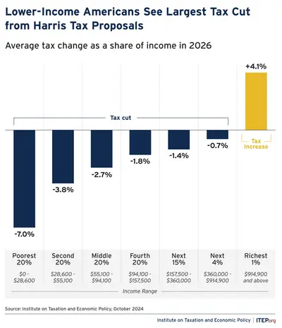
I am fairly sure these graphs indicate changes only for federal income tax brackets, no capital gains.
Ooh, that’s a handy graph, should be shared with more people who might not necessarily lean Pro-Harris but do care about the economy.
It won’t work. They assume they’ll somehow slide into a higher, benefited bracket if the Republicans succeed. Something about trickling down the wealth but thinking they’re the only ones that’ll be fit, floating them to the top.

Was it this one?
It was, thank you so much!
Have you searched online at all?
I think copy pasting your post literally to the dot on Google gives the result. (CBS news) :
Harris and Trump have competing tax plans. Here’s how your paycheck would change under both.
First result too. Amazing.
Sometimes I wonder if people like you don’t see the disrespect in asking other people to do things you could do in a matter of seconds out of pure laziness.
I obviously won’t link the article because I’m too pissed and I think you need to learn that people here are not working for you. This post is a literal waste of space and time.
Pure entitlement, distilled in a comment. It’s possible they didn’t do enough Google-Fu and instead asked this community for help. Instead, you berated them, then purposefully withheld the information. In other words you are way more annoying and wasted more of your own time than just ignoring it and moving on.
(By the way, I found the actual replies informative, proving the usefulness of the post)
Not this one, but thank you! I’m looking for one which had both their pictures on it, with Trump on the left.
Edit: I did look online as well as scroll back on Lemmy until I felt seasick, to no avail.


