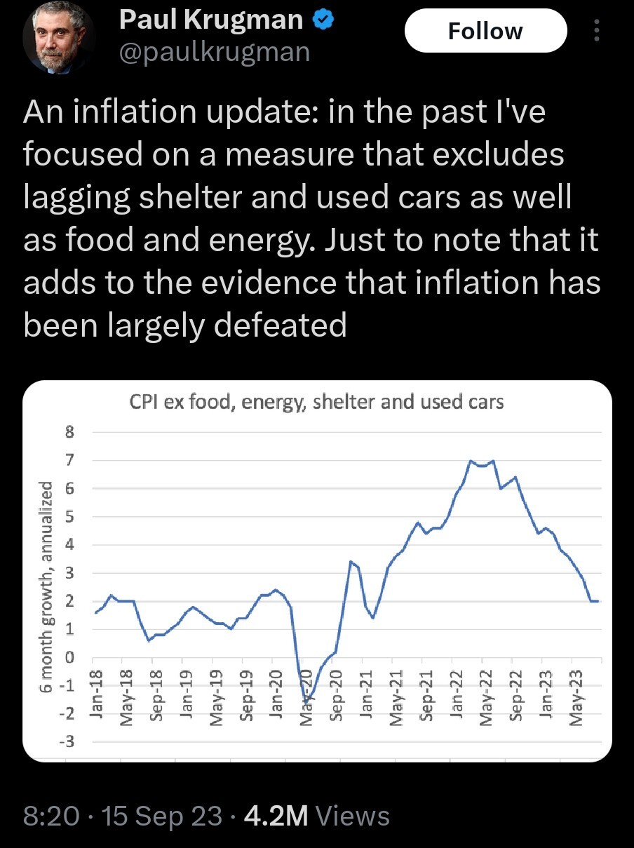
It’s silly to present only this graph, then. Surely it’s possible to put a dashed line next to this one that includes the “lagging” measures and just stops where the data stops or becomes unreliable, but would still show the trend(s).
Or hell show each component as a different line, maybe faded some, and end each line where the data become questionable, and put the composite line darker/bolder. Lots of good options.
If we’re back at/near the target 2%, that does count as “defeated” from the point of view of the monetary policy makers. But I’d need to see complete inflation data to be certain. If we’re missing inflation data because it “lags,” then we’ll know one way or another later.