It makes it easier to prioritize what I work on if I know someone’s wanting a feature. What sort of stuff do you wish Alexandrite had? Especially talking about missing features from the main UI.
If you can, please provide some explanation for why you would like that feature and what problem it would solve for you (unless of course it’s a feature that Lemmy has already but Alexandrite doesn’t support yet). Knowing what problem you want solved helps me work with you to brainstorm ideas for the best solution (see the XY problem).
I built a FFox add-on called Mullem which basically simulates a multi-reddit like experience. It’s quite basic so I’d love to see the same functionality in Alexandrite :)
Nice! What, and run you out of a job? No way! :P
I’ll put it on my todo list and try and brainstorm how I might do that (no promises though!)
Hahahaha :)
Mine’s limited (no login, pulls and combines RSS feeds via a 3rd party server due to CORS etc) but yeah - just a thought :)
You might not need the proxy stuff anymore. I believe Lemmy 0.18.1 added more permissive CORS settings, which is why I was able to move all of Alexandrite’s API usage client side.
Oh really? That’s interesting - I’ll have a look into it, thanks :)
A button to expand all image and ability to browsing page by page.
A button to expand all image
Do you mean a button that makes all the posts in your feed have their content expanded by default? Like the “Show Content” button does? Or only expand images and not link previews/text posts?
Do you want this because you want to be able to see the image attached to a post full size instead of a thumbnail so you can see it without clicking the post? I was planning on adding alternate layouts for the post list at some point. If you had the option to view the post list as cards with full sized images, like what Voyager (wefwef) does, would you prefer that instead?
ability to browse page by page
Do you just prefer having next/previous page buttons, or is it because you want to not lose your place if you scrolled a bunch? I ask because I’ve been trying to brainstorm a way to allow users to resume from the page they were last on. Like if you’re on the home page and click a link, then you go back to the home page I was thinking of having a button like
Resume from page 37, and clicking that would clear the feed and start showing you posts from page 37 onward. Would that help?been trying to brainstorm a way to allow users to resume from the page they were last on
This is kinda where my columnar layout obsession comes from (sorry!). Keeping each column as independent as possible can work really well (if you’re into columns like I am). I’ve mentioned this before, but mastodon’s columnar layout might be worth looking into, because they’re both independent, and, in the case of the “Main view column”, which shows the stuff you select to view, has a “Back” button at the top while keeping the others independent and static.
Let me know if I get too loud about columns! I know not everyone likes them!
That would be nice. I still haven’t played with it on Mastodon yet.
Nah you’re good! The current implementation is really simple, and the stuff you’re suggesting is a lot more complicated so I’m still just trying to figure out how I want to solve the technical challenges of it before adding anything. :)
Do you mean a button that makes all the posts in your feed have their content expanded by default? Like the “Show Content” button does? Or only expand images and not link previews/text posts?
I originally only wanted to expand images but expand all content work too. But I like it as a button then a layout, some times I wanted to find a post I had browsed past, I could collapse all post and then try find it.
Or maybe a button at the end of a post to collapse that specific post, most of the buttons to interact with the post is at the start too. Some posts could be very long, I might not want to scroll past it again.
This work best for me when I browse page by page on reddit with res, because the button show all images is at the top of the page :))
Or maybe a button at the end of a post to collapse that specific post, most of the buttons to interact with the post is at the start too. Some posts could be very long, I might not want to scroll past it again.
I just tried this and it’s nice, but when you scroll past a long post and then hit the “Hide Content”, unless I make it scroll back up to the post you just collapsed, now the space the expanded post used to occupy is filled with more posts you might have scrolled past some. Not sure what’s the best thing to do here.
Being able to save/favourite a comment. It’s available for posts but not comments … even though the best stuff is always buried in the comments!!
Also, most or even all of the menu options lemmy provides for comments are probably useful. Seeing the source can be useful for seeing how markdown works and copying text. The blocking and reporting options are probably important too. And the “send message/DM” option could also come in handy (?)
Yeah I’ve been meaning to add those but I had been waiting until I did the client side API usage rewrite before doing more stuff, now I can do that. I’ll throw it on my todo list for stuff to do after work today.
Awesome! No rush here … I’m just casually shooting suggestions
Hey I just added all of this, and a few extra options on posts. Also you can manage blocked users in the settings too.
All of it is stuffed in an overflow menu, so I didn’t bother showing the loading indicator and stuff like I do with the other actions. Maybe I should add some more toasts for successful actions too (everywhere, not just here).
Edit: Moved ‘save’ out of the overflow menu to match posts.
Nice! Quick check on mobile and it all looks good!!
Love the interface! It seems to have solved all of my remaining issues with Lemmy in one gorgeous package!
I’d love to be able to:
- Pin the left hand side bar so that it is always visible (much like the right-hand one)
- Be able to favourite communities so that they appear at the top of the list in the left hand side bar.
And if these two things sound remarkably like “new” Reddit, then you’re right… I’m unashamedly a fan of that layout and having it here would make me feel right at home :)
Thanks again!
If you hover your username at the top right it shows your lemmy settings, pretty much access to change all that and nsfw blur toggle.
I’ve been thinking about the NSFW blur toggle stuff. I’m thinking about having maybe three options: 1. load and show, 2. load and blur, 3. don’t load until you click a “show image” button of some kind (actual details of that tbd). Thoughts?
I personally would be ok with even just option 1/2 or 1/3 but if you want to play with stuff and be fancy do it :)
Hello, really love the app it is beautiful.
Could you please add the reports icon / ability to access it for moderators as of now I browse using this but i cannot access the /reports page
this is on base lemmy

and this is Alexandrite

I actually was working on that last night. It’s getting close!
Fantastic news thank you!
Also is there some thing I need to do differently to get the !alexandrite to pop up the box to select https://lemmy.world/c/alexandrite for linking in markdown?
Same thing with the : to prompt emojis
I actually haven’t added any of those popups when typing things yet, so you’ll have to wait I’m afraid!
No rush I was just curious. Thanks for your hard work, Alexandrite is gorgeous!
By the way, I’ve never really modded a community so I’d love to hear what you think would be useful features.
So far I’m adding:
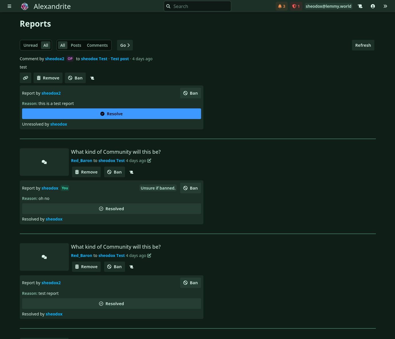
- the reports page as it shows in the screenshot (you can ban/unban users, remove/unremove posts/comments) and ban reporters if they’re being bad (though this has some issues, I haven’t been able to figure out how to check if they’re banned unless they’ve made a post/comment that also shows up in the /report feed, hence the “Unsure if banned” messages)
- remove/ban buttons from the little down arrow menu button on comments and posts
- mod log page
What else would you want?
Those are all great, maybe adding the M and A badges to indicate a user is a moderator or admin.
Having the mod tools available from the report screen is fantastic, along with the link to comment icon.
Maybe a section in the three line menu in the top left that has “Communities Moderating” above the subscribed ones, or placing the communities you moderate at the top of subscribed communities list.
The icon to pin / lock a post in a community is missing:
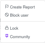
Accessed through the little down arrow menu button on posts.
Also the appoint as mod button that would be accessed from the little down arrow icon on posts/comments
That is all I can think of at this point but I’ll edit this comment If I think of anything else.
Thanks again!!!
Thanks! Added that all to my todo list.
I just added a bunch of mod tool stuff. Update announcement
I would love a way to have the main post images be larger so I don’t have to click to expand from the thumbnail for every single image; something more akin to the mobile applications.
Additionally, I’m not sure if it just hasn’t been implemented yet but the color changer in the settings doesn’t work for me :) I’m browsing on firefox, FYI.
Yep, I planned on overhauling how I handle images so you can just click them and it’ll show full size in an overlay like on chat apps like Discord. Is that what you’re looking for?
Do you happen to have the Dark Reader extension? I’ve noticed with Dark Reader enabled that happens!
No I’m looking for an app that has the images already pre expanded to a visible size, much like on mobile you (on most apps by default) don’t need to click the thumbnail to view the image; it’s already automatically at a legible size.
Does that make sense?
Gotcha. On each row in the list there’s a little “show content” button that shows the attached image/post body/link preview stuff right there, would a setting that defaults that to open automatically be what you want, or would you prefer if it only auto-shows attached images?
I think auto showing images, and maybe if it’s a text post a preview of the body, or like embedded images for links and stuff. A more card based view is what I was looking for! A setting for that would be pretty amazing :) You can take a look at Nemmy’s desktop view to see kind of what I’m talking about. It’s very early in development (and I’m hoping to help with it actually) but it gives a good idea of a type of desktop experience I think is currrently missing
Gotcha, yeah I was planning on doing something like that card layout stuff sometime soon probably. I’ve been working on an alternate feed layout that lets you view a post side-by-side with the feed, and having extra options for how things show in the feed would be nice.
(btw, if you want to try out this column view thing you can view the preview verison, still might have some bugs, and the defaults right now probably squishes things unless you have a high resolution screen but if you close the sidebar it should look nice at 1080p, also you have to go to the settings page to change your page layout to “Columns”, accessible from the user button in the top right).
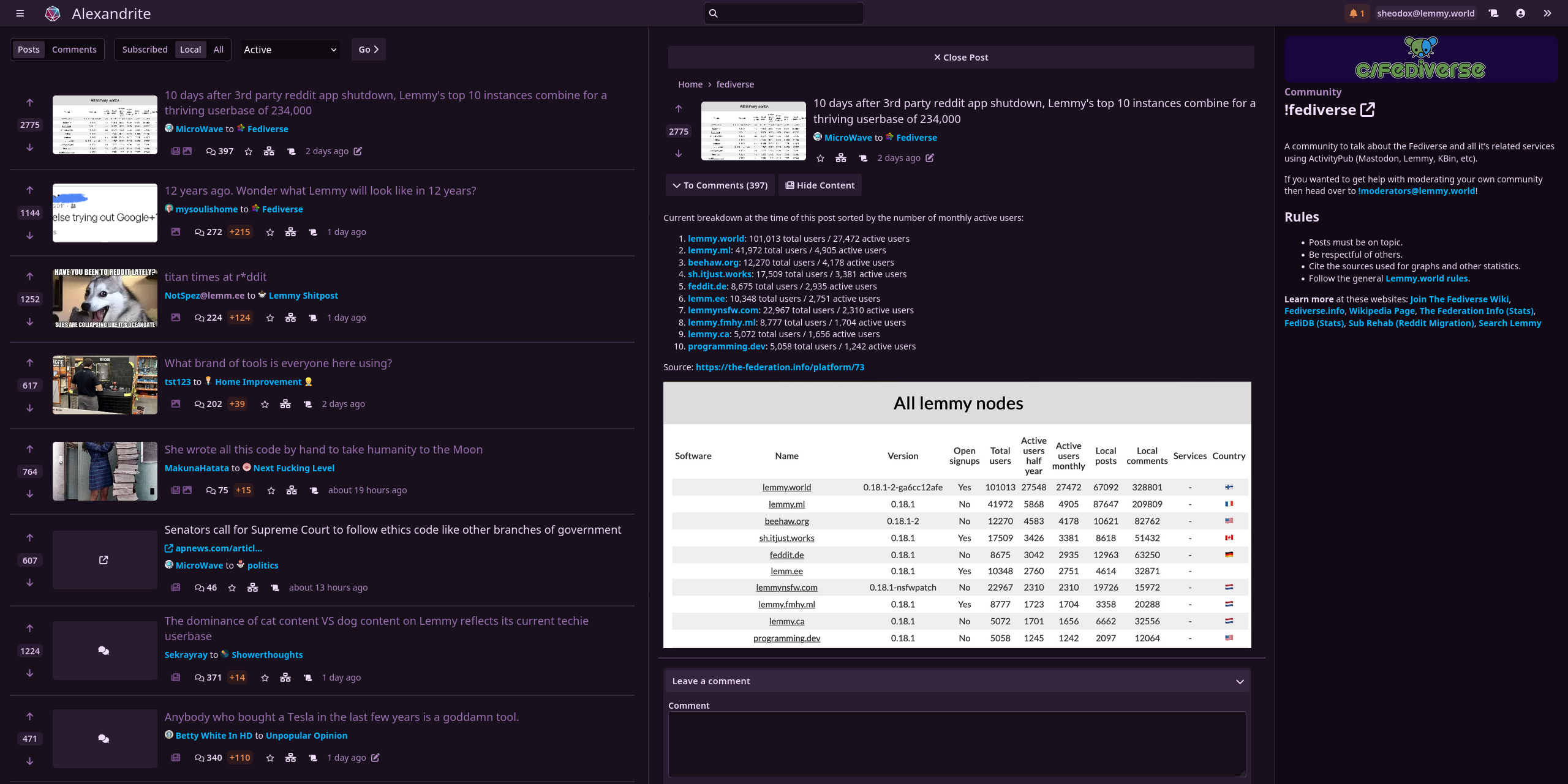
That looks great and I love that idea! Keep up the great work!
Thanks!
By the way I found and fixed some bugs with the theme stuff so hopefully it works all the time now! Not sure if it was Dark Reader causing the color change issues for you or that other bug, but it should work now!
The bug was that occasionally things would load in a different order and your chosen color would apply too early and wouldn’t actually override the site’s theme. I could really only get it to happen occasionally and by completely clearing localStorage and signing in again, so it was a little difficult to track down.
FYI if you didn’t see it already, I released that column view update and a bunch of other stuff. Announcement post.
Unless I’ve missed something, there’s no way to save one’s settings…this could be my issue though as maybe they’re in persistent cookies - I have my cache and all storage set to clear upon exiting the browser.
Would it be possible to generate a unique URL with ones chosen settings in the querystring? Lots of privacy specific web based software does this (teddit.net, Whoogle etc). It would mean we could bookmark a URL which could restore our settings.
Oh that’s an interesting idea. I’ll think about it.
I have accounts on multiple lemmy servers (2 main ones, and one “alternate” one. I haven’t decided which main one to use exclusively). I’d like to be able to swap between them the way I can on the various android apps.
It’s in now! Announcement post
I was planning on implementing this soon! Because they are all pretty related I wanted to do an account/profile switcher at the same time as I also:
- put the instance in URLs like Voyager does so links to Alexandrite are sharable and don’t require you to be logged in to the same instance as the person sending the link
- support self-hosting Alexandrite
Great! Thanks!
Default comment sorting would be awesome. I usually sort comments by “top”, and having to press that every time I load a new post is kind of annoying
I really want to hide the sidebar…
Now you can! I added a new button in the top right to toggle it.
Amazing, now I can use your app as my main desktop web client :)
Love to hear it! :)
A few people want this, I’ll make sure to get this added after work today.
Is there any plan to add the markdown image functionality of the base U.I, either the small picture icon to prompt an upload or the ability to paste an image into the post/comment box to have it upload and inster with the proper markdown?

Also any thoughts on adding the archive prompt for a url post?

I’ve been recommending this project to everyone i know online that uses the lemmyverse
Image uploading is something I really want to add because it’s the biggest missing feature and I think it could be done better than the official UI does it. Unfortunately I can’t add it quite yet because I’m not able to upload images unless I proxy them through Alexandrite’s servers (which is what Voyager does). This is the issue on Lemmy’s Github that I’m waiting on.
I was thinking of adding the archive links around the time I add the image uploading.
I’ve been recommending this project to everyone i know online that uses the lemmyverse
Thanks! It’s been getting a lot of attention lately which is exciting and scary. This is by far the most attention any of my side projects have gotten, and it’s pretty cool to see so many people enjoying something I made!
Makes perfect sense, didn’t see it on the feature request so thought I’d pop it in.
Attention well deserved you’ve made something terrific.
Minor suggestion: Return to top button. I know I can just refresh the page to get back to the top to change my sort settings, but I think it would be useful.
Another one would be a black option for the interface color. The closest I could get for a “dark mode” experience is dark blue.
Also, more compatibility with posts that have gifs so they can be opened within the page.
Love the app btw, please continue doing what you do!
Return to top button is in! Update announcement
Amazing! That was fast. Thanks! I think you just got a loyal user here.
Minor suggestion: Return to top button. I know I can just refresh the page to get back to the top to change my sort settings, but I think it would be useful.
Will do! I also want that button.
Do you happen to have a link to a post somewhere so I can test out the gif stuff?
Love the app btw, please continue doing what you do!
Thanks! I always love hearing that.
Being able to collapse not just the text of a single comment but the whole branch from that comment down.
Not vital or most wanted … but would definitely be nice. I would suspect though not many people would or do take advantage of such a thing.
Maybe I’m missing something, but collapsing a comment should already hide all the replies to it. Is that not working?
You are right and I am blind!! Sorry!!
Woo, easy fix! ;)
Being able to save/favourite a comment. It’s available for posts but not comments … even though the best stuff is always buried in the comments!!
Also, most or even all of the menu options lemmy provides for comments are probably useful. Seeing the source can be useful for seeing how markdown works and copying text. The blocking and reporting options are probably important too. And the “send message/DM” option could also come in handy (?)
