Made a flag for a fictional country, Vefkovîî. How is it?
I like the concept, but I have a few suggestions:
- Maybe make the green a bit darker. I get that you’re going for grass and a river, but that’s conveyed with any green, and I think a dark green would go a lot better with the lighter blue.
- As another commenter mentioned, the river would be better as a simple diagonal stripe. You don’t need a complicated river shape to convey a river.
- This may be limited by your drawing skill, but I think the emblem should be more complex. Right now, it’s in this area where it’s not simple enough (i.e., it’s not just a flat, one-color shield) to match with the rest of the flag but it’s not complex enough to really feel like an emblem. It stands out but doesn’t quite have the complexity to warrant it, if that makes any sense.
- The emblem might be better off in the middle, left, or upper left. Symbols on flags tend to go there instead of on the right, where it’ll be flapping in the wind more.
Updated it a little😁
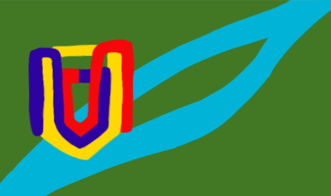 The grass is more dark,
I simplified the river, didnt made it a strip because I want it to convey an island.
I moved the emblem to the left, someone else said to make it more simple, but I dont have ideas
The grass is more dark,
I simplified the river, didnt made it a strip because I want it to convey an island.
I moved the emblem to the left, someone else said to make it more simple, but I dont have ideasThe new green and the emblem on the left are definitely improvements. While I get wanting to convey an island, I think you could still do that with a more geometric shape. Maybe a stripe that splits into a circle or diamond in the middle. If you’re going to have a line going diagonally across the flag, I think it’s best to have it be simple and geometric.
Liberian county flags be like

Didnt belive, checked wikipedia, true lol
Pretty cool. The emblem is a little complex (but looks cool, so whatever), and the lack of geometry in the blue river is frustrating, but it’s overall cool looking.
Updated it a little
It may look better with one blue diagonal line instead of the current river like stripe. The emblem could be put in the middle if keeping its size, or put in the upper left side with smaller size
Looking into making the river more simplist


![[UPDATED] My fictional flag](https://lemmy.zip/pictrs/image/95be16a0-5f32-496d-8ee6-c6277cef46b5.webp)