We just added Alexandrite to the server, it’s an alternative desktop UI for Lemmy created by Sheodox who worked tirelessly to make the necessary changes to we could host it ourselves here. So go to https://a.lemmy.world and have a look!
He continues to update it constantly, you can follow the development on his github page or in his community. If you like what you see and want to support him, why not buy him a coffee? :)
For those who don’t have Lemmy World as their home instance and want to use Alexandrite, either ask your instance admins to add it or go to https://alexandrite.app!
Edit: I should probably have mentioned that Alexandrite is meant for desktop!
Huh, as soon as I went to the link I got banned by the server admin and rate limited?
Rate limits are being tweaked to combat ddos. You might experience some issues while they are being optimised. Apologies
Yeah, I tried to reload the page because it already showed an error.
I did get a successful hit on the web page. It’s good that they are finally tackling the screen width issue. It also comes with auto-reloads as well.
My only complaint is that the items are a bit too tall. It could be shrink down to a more compact space to fit more items per screen-full.
Thanks for adding these UIs as an alternative. Especially m.lemmy.world, it feels like a native app.
The m. Is voyager app. You can actually make a shortcut on your phone and it turns into an app.
Using it right now! But since I do, I wonder how (why) this works? What keyword would help me find info about that?
Progressive web apps!
Also an app app now, available in beta.
Am I missing smthing? If I open vygr or old I see posts. When I open a.lemmy I can only see a generic post about lemmy nothing else
(dev here) Sorry! The post forgot to mention Alexandrite is meant to be a alternate UI for desktop. There are a lot of issues if you try using it on mobile at the moment, because I haven’t done the work to support it yet. I would keep using whatever you’ve been using on mobile.
Yes I should have mentioned that. I updated my post
maybe it is because it is set by default to local, try clicking on all instead.
I found the arrows that toggle sidebar and setting it to All shows this in android Firefox:
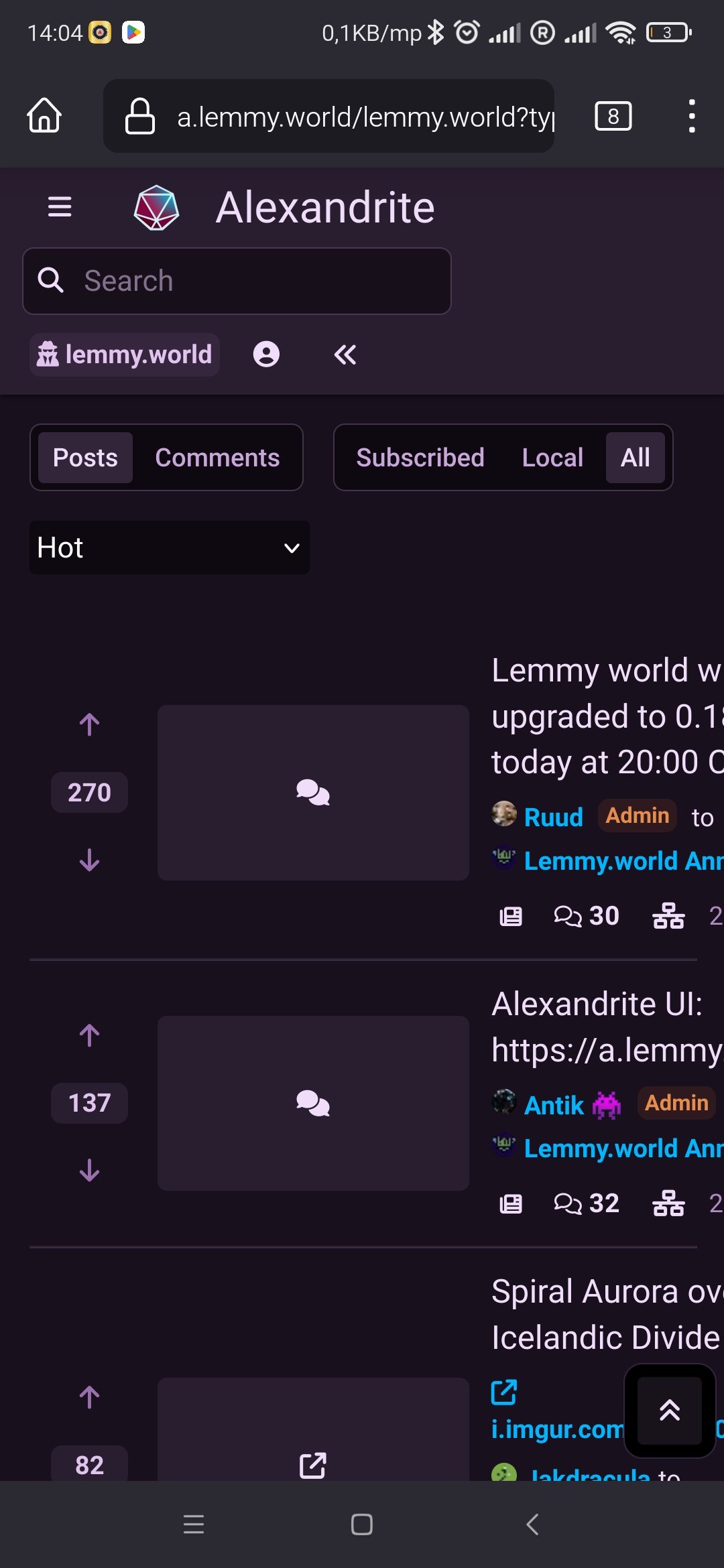
If I close the sidebar all I can see is this
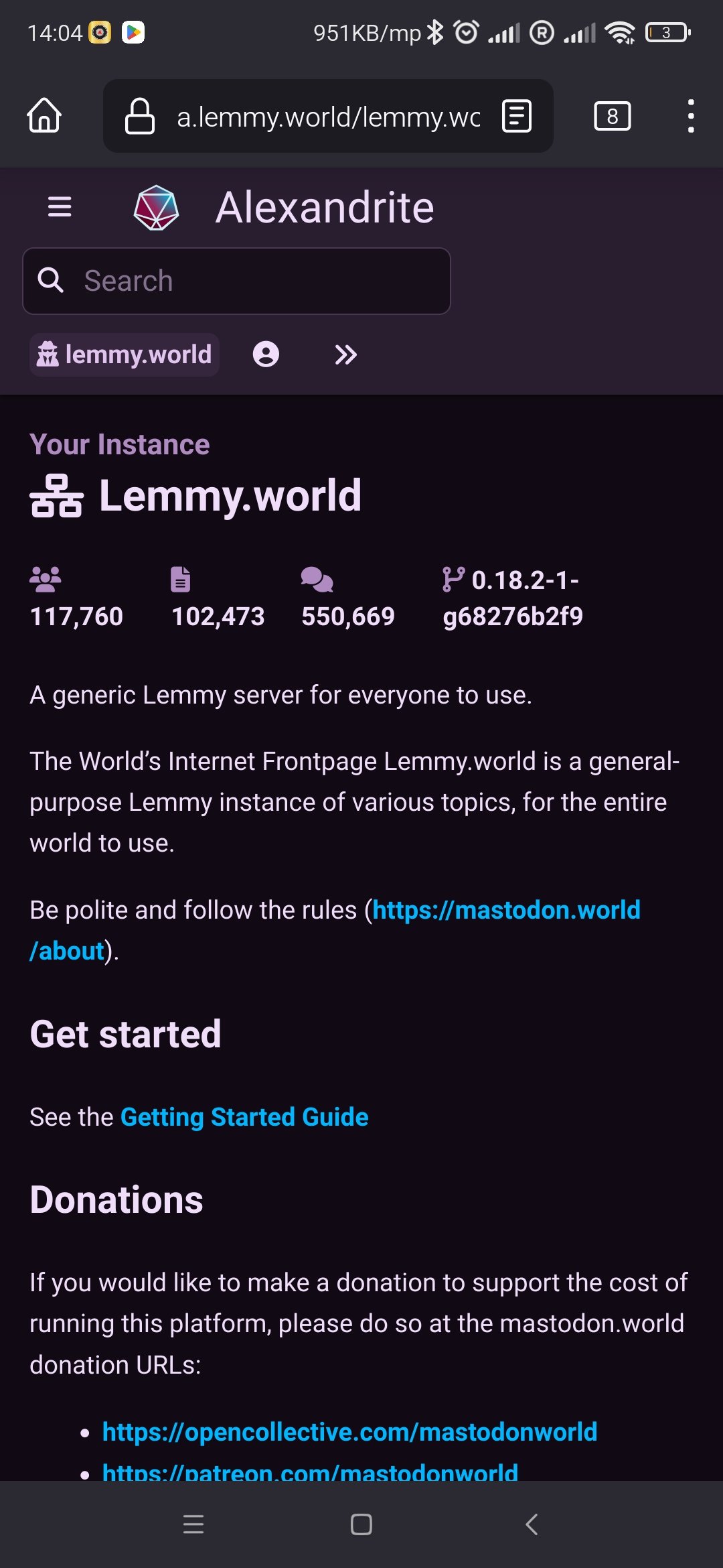
It’s actually more for desktop. I updated my post
What I really want is a design that shows me twice as many posts at a time, there’s too much wasted space.
If you want old reddit, just use old.lemmy.world
That’s pretty handy to know.
But I kinda like the way Alexandrite looks, I just wish it was more compact.
Compact, like this? https://photon.xylight.dev/c/[email protected]
Hi there! Looks like you linked to a Lemmy community using a URL instead of its name, which doesn’t work well for people on different instances. Try fixing it like this: [email protected]
I’m planning on adding alternate post styles in the (hopefully near) future. A more compact style is one of the styles I want to add.
I agree. I hate the trend of moving away from information density. It may seem silly, but it’s the number one reason I can’t use an iPhone.
we already have it
I agree. For now, as I find everything to be a bit too big, I put the zoom at 90% in my browser.
I wish my browser would remember zoom settings for different sites.
Are you on Firefox? I use an extension called PagezoomWE or something like that. It remembers the zoom level for you.
Vivaldi.
I like the UI so much more than the standard Lemmy. This should be the default UI. Hopefully he make a light version.
I need a light version.
That’s how it should work! Click on post and instantly see the content and comments, without loading a whole page
Wow, thank you. I acutally was hoping you were going to add this becasue Alexandrite is the best desktop UI for Lemmy so far.
It also means Lemmy.world is turning into the best instance already because they’re the most user-friendly and customizable one.
Great work!
FYI: I got rated limited on the first link but the second time worked right away. There might be some glitch there.
Rate limits are currently being fine-tuned so yes there may be some issues at the moment while our team sorts things out
I’d just like to say that some of us smaller instances have had both old.* style and Alexandrite active for a a few weeks ;)
- old.lastname.nz (0.18.3 has broken this for now)
- my.lastname.nz
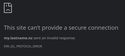
Well maybe not.
I guess ill have to look at why, it works from home
Anything that gets nearer to a RES-like experience from Reddit is an absolute plus. This UI is brilliant.
The genius thing about it is the way it fully utilizes the whole width of a display, with the post content appearing in between the list of posts and the sidebar. I haven’t seen another Lemmy/Kbin UI that does this.
It might only be suitable for widescreen desktop use, but it does that one thing very well.
yes, goes well together with Voyager. From app subdomain I route mobile clients to Voyager and desktop to Alexandrite, feels amazing.
As soon as I click on a link I get rate limited. That may need to get adjusted.
Does this still happen?
I just had it happen
Edit: but now I can use it
Ah. Will look into that.
Immediate rate limit. Opened home page, pressed communities.
Rate limited.
Rate limits are being tweaked to combat ddos. You might experience some issues while they are being optimised. Apologies
Thank you for your work!
Just dropping in to say this UI is beautiful and the features are superb. Thank yous for all the lemmy world staff and Sheodox for the time and dedication!
beautiful! and the fact that i dont have to open a new tab for comments!
Seeing custom web UIs being deployed officially and directly on the same domain as Lemmy instances is incredibly encouraging. I wonder if my Leanish will be polished enough to be published that way eventually.
One can dream!
I’m in love! Smooth, modern, and simple. One thing to note - the “hue” option for the theme in the settings is not very obvious at first or comfortable. We need some kind of visible color pallete or some squares with color options. Also, Ctrl+Enter should allow me to post my reply immediately, but it doesn’t.
I love this, thanks.


