- cross-posted to:
- [email protected]
- cross-posted to:
- [email protected]
cross-posted from: https://lemmy.zip/post/13730919
F/5.6 75.0mm 1/320s ISO-200
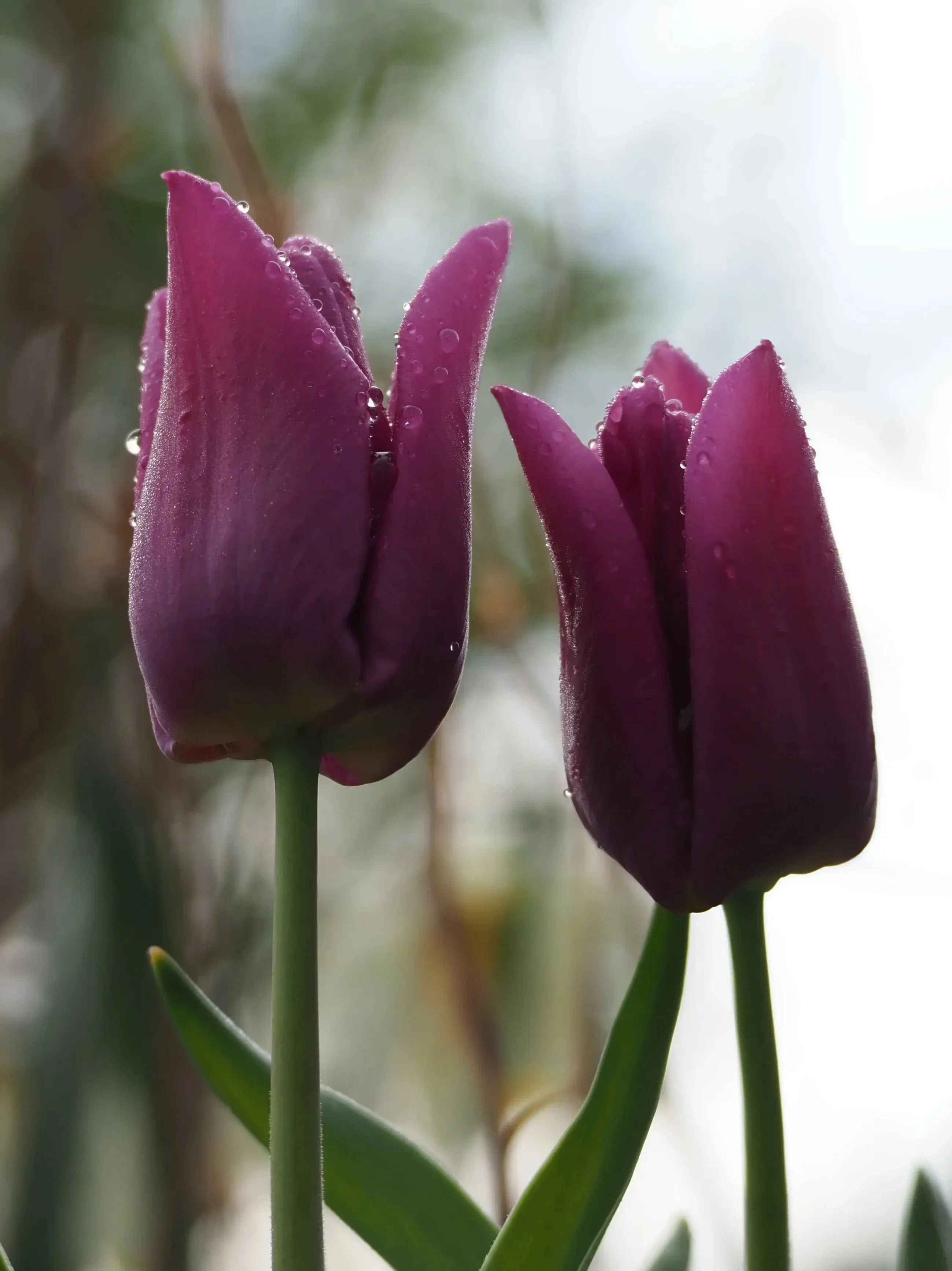
Here’s a photo I took recently, and I’m just curious if anyone has any feedback on what they like about it or what they think would improve it. No editing other than some compression to lower the file size below my instance limit.
If I were to go back to it again I would probably try to use the stem of the flower to split the background between the bush and sky. Other than that I’m not sure, I’m still trying to learn!
There’s more that more experienced photographers can put more eloquently, but as a graphic designer I have two immediate points of feedback:
- Editing wise I would up the saturation a bit, and a bit more contrast in the lighting.
- The framing could be better: the part of the flower seen on the right adds nothing to the composition and distracts. Cropping it off would be better.
Thanks for the input! I had crossposted it to the .world instance as well, and someone there had suggested a tight crop like this which I really liked.

I will definitely try what you suggested! Editing is something that I would like to dig into more.
It looks great like this
Since you’re asking for feedback, I would say the background is a little busy for what I would guess your intent is of having a crisp flower shot.
The framing might be improved by simply cropping out the tulip on the right completely.
If you’d been able to swing the camera around to the left a tick, would that have enabled you to not have the trees directly behind the flowers? Even just pushing them to the side of the frame without removing them entirely could have maintained some background interest without having the contrast of the bokeh edges sitting right next to the sharp edges of the in focus flowers.
This might just be my screen, but it’s a bit dark. Flowers generally like to pop a bit more.
Good focus regardless.
Sounds good, thanks for the input!


