felixwhynot@lemmy.world to Mildly Infuriating@lemmy.worldEnglish · 1 month agoSteam has the best UImidwest.socialimagemessage-square52fedilinkarrow-up1226arrow-down136file-textcross-posted to: [email protected]
arrow-up1190arrow-down1imageSteam has the best UImidwest.socialfelixwhynot@lemmy.world to Mildly Infuriating@lemmy.worldEnglish · 1 month agomessage-square52fedilinkfile-textcross-posted to: [email protected]
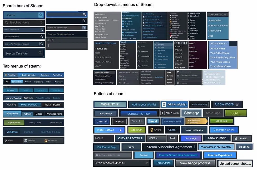
minus-squarestoylinkfedilinkEnglisharrow-up100arrow-down3·1 month agoYour lack of sorting makes it look worse than it is. Just looking at the buttons, they clearly have design documents, green is only used on buttons dealing with money. Blue buttons primarily deals with social interactions or midrange store tasks Grey buttons are for the local client
minus-squaremaymay@lemmy.worldlinkfedilinkEnglisharrow-up6arrow-down8·1 month agoThat would be 3 buttons not 40 like in the picture
minus-squarestoylinkfedilinkEnglisharrow-up4arrow-down1·1 month agoNo? I only mention colors, not styles.


Your lack of sorting makes it look worse than it is.
Just looking at the buttons, they clearly have design documents, green is only used on buttons dealing with money.
Blue buttons primarily deals with social interactions or midrange store tasks
Grey buttons are for the local client
That would be 3 buttons not 40 like in the picture
No?
I only mention colors, not styles.