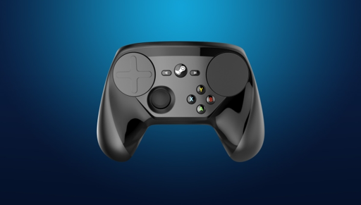
Better battery placement, because the original is a nightmare to get batteries out.
I’m curious about this. There’s a little switchy button thing and the batteries pop right out. I’m not sure what makes it a nightmare, I quite like the battery placement.
Rechargeable AAs like to get stuck in there since they are slightly thicker
Then that’s an engineering mistake / wrong fits, instead of an “battery placement” issue
I’ve always used rechargeables. While I agree to some extent, the action to pop them out makes it a lot easier to get them out than in the Xbox 360 controller from around the same time. The Xbone ones are easier now but perhaps they will do steam controller 2 in a similar way to the 1 but leave a little extra clearance.
It takes an extra second to read/see what you are supposed to do, but after that I have to agree with you, I also like the placement and actions required to replace the batteries.
I thought it was really satisfying. Not to mention just really clever engineering. Back when I still had one I was popping the batteries in and out like it was a fidget toy, definitely wouldn’t call it a nightmare
Sweet mother of god, yes: my body is ready for another Steam controller.
Take my money
Last one was garbage. Not sorry.
Imma need you to expand this answer.
I don’t care for controller gaming much, but this one didn’t strike me as notably worse than amy other.
Bad shape, poor feel and quality, and the track pad takes up too much space for a hack.
Limited official game support made it a detection nightmare and caused quite a few games to register it as m&KB.
Haptics on PS5 are also much much better.
A 5 year older controller is obviously going to be worse ,but the game support is valid
The PS4 controller and Xbox from previous Gen are still better minus the PS5 haptics.
Fair.
I do hope the shape is improved. The main reason I sold my og steam controllers is because I couldn’t figure out how to hold them comfortably. My steam deck feels amazing in hand though, so I hope it’s like that 🤞
This man speaks the truth. Haters be damned.
Idk why you are being down voted it’s true. It was a plasticity nightmare. And I don’t understand how people liked the track pads. There’s a reason a carry a mouse with my gaming laptop because there’s no way I’m going to play a fps with a track pad
The gaming community for whatever reason mostly has hard on for value. Despite them rent seeking and being a generally shitty company where it matters.
Paid betas killing discs…yay steam!


