
- cross-posted to:
- jrpg
- gaming
- retro_gaming
- playstation
- cross-posted to:
- jrpg
- gaming
- retro_gaming
- playstation
You must log in or register to comment.
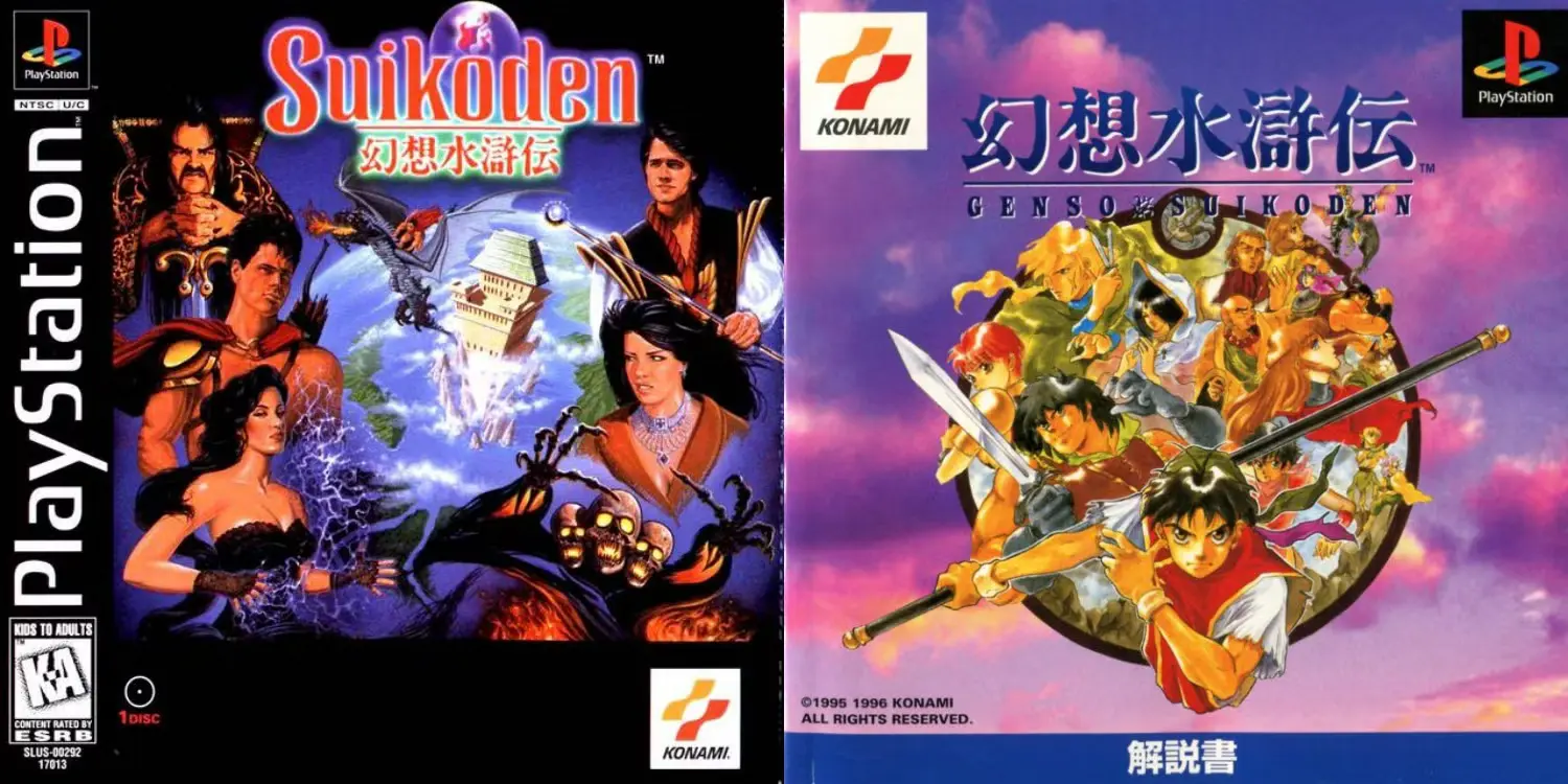
It’s such a shame that Western publishers were so ashamed of games Japanese origins. For me, being a teenager at the time, I wanted anything and everything Japanese I could get my hands on. I felt like this was the case for a lot of people at the time. It’s why anime and manga were exploding in popularity.
You’ve unlocked a childhood memory. I was like twelve browsing used video games, guy at the store asked me what I liked and I said RPGs. He handed me a copy of Suikoden and said “I know it looks like absolute garbage but I promise it’s actually really good.”
At the time, my taste hadn’t developed enough to understand what was wrong with the American box art but I didn’t say anything.
A list of several boxarts for Suikoden: https://gamefaqs.gamespot.com/pc/948855-genso-suikoden/boxes
The PAL version uses the original art from Japanese release. I think it even improves on it by having a white background, which looks more classy to me: https://gamefaqs.gamespot.com/pc/948855-genso-suikoden/boxes/10236

I mean the JPN cover is much more true to the original game ascetic and is more artistically pleasing…
But c’mon the US cover looks like a frickin 80s fantasy trash movie poster. Retrospectively that’s so iconic.
I could swear my original US release had some weird combo of the two. I gave away 90% of my PS1 and PS2 games last year so I can’t check now, but I really think it had the main image shown from the Japanese release on the case. Maybe the image was shown in game on the loading screen or something and I am just remembering it wrong.
I remember this circle art being inside the American manual.
Maybe that is what it was that I am thinking of.
Ah yes, the era of US box art so ugly the mind reeled wondering how it ever got approved. Look at the US and JP cover art for Mega Man for one of the most iconic examples in a target-rich environment.
Japan

US
