BonesOfTheMoon@lemmy.world to Memes@lemmy.ml · 1 year agoComic sans.lemmy.worldimagemessage-square23fedilinkarrow-up1564arrow-down111
arrow-up1553arrow-down1imageComic sans.lemmy.worldBonesOfTheMoon@lemmy.world to Memes@lemmy.ml · 1 year agomessage-square23fedilink
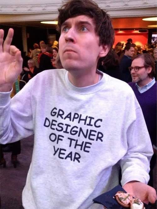
minus-squarepaddirn@lemmy.worldlinkfedilinkEnglisharrow-up19arrow-down1·1 year agoToo clean. Should’ve used multiple fonts, stretched/compressed them, and messed with the leading & kerning. Then exported it as a low resolution jpg.
minus-squareDyskoloslinkfedilinkarrow-up2·1 year agoAnd too neatly centered. And also just two colors. And also the same line-height. This shirt was a wasted opportunity. But maybe that is a bonus? 🤔
minus-squarechiliedogg@lemmy.worldlinkfedilinkarrow-up2·1 year agoNeeds to be full-justified so that “Year” takes the same space as “Designer.”
minus-squareDyskoloslinkfedilinkarrow-up1·1 year agoToo neat. It should be oddly rightcentered but 8° rotated for no real reason 😎

Too clean. Should’ve used multiple fonts, stretched/compressed them, and messed with the leading & kerning. Then exported it as a low resolution jpg.
And too neatly centered. And also just two colors. And also the same line-height.
This shirt was a wasted opportunity. But maybe that is a bonus? 🤔
Needs to be full-justified so that “Year” takes the same space as “Designer.”
Too neat. It should be oddly rightcentered but 8° rotated for no real reason 😎