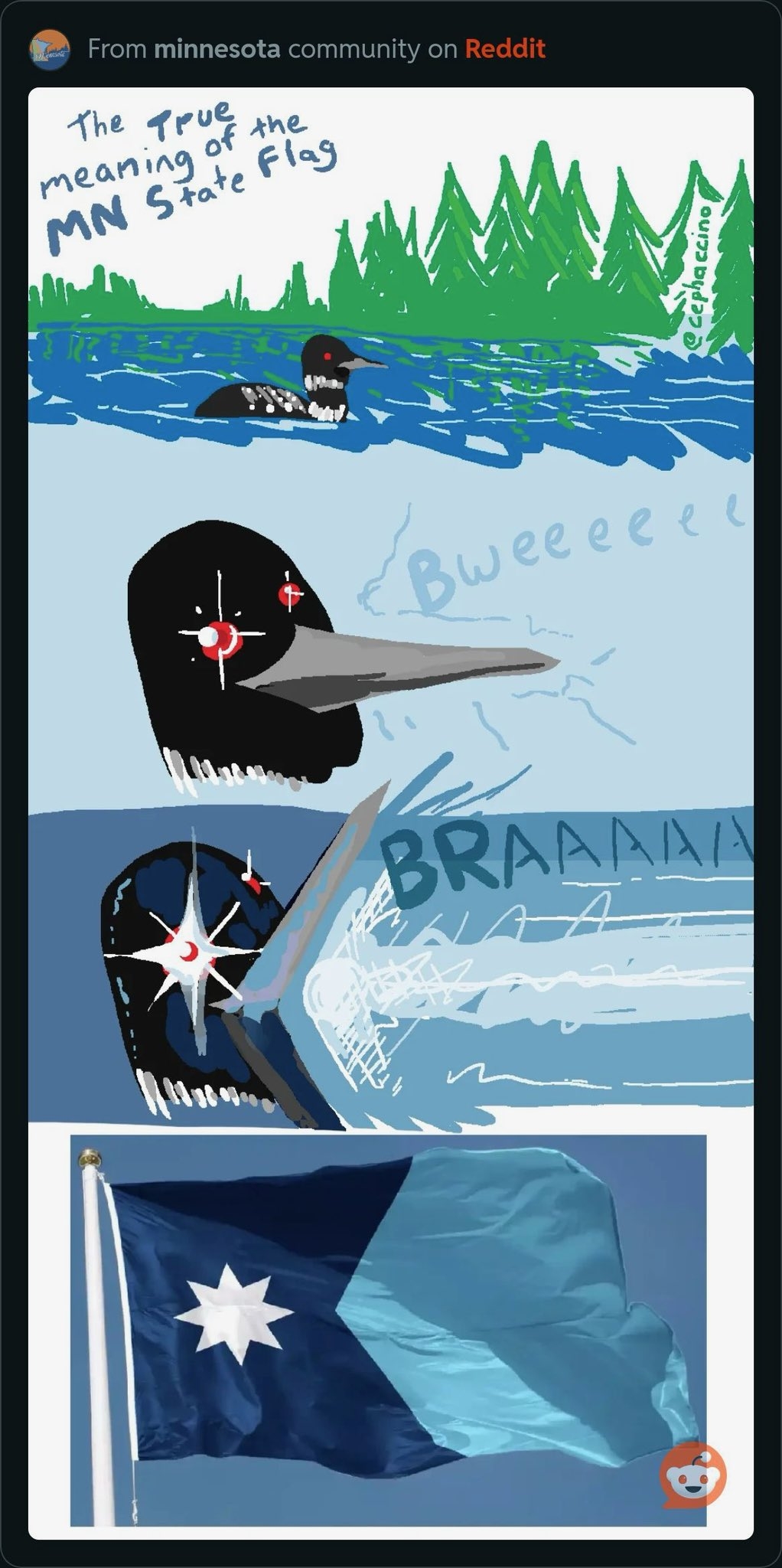


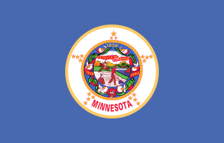
Reddit man has no standards. Like I kinda agree with him, State seal flags are boring af
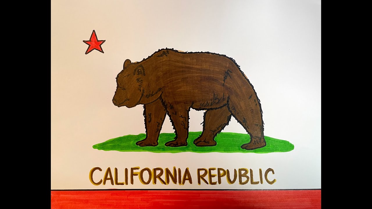
But his extremely reddity argument of every flag has to have straight lines is so stupid. Colorado and Cali have beautiful and instantly recognizable flags. Even if the bear on Cali flag is a bit complex, you dont really have to draw 1:1
Joel is right here, the wavy one’s the best. the star on others look a bit weird.
I love my simple socialist flags like  , 🇻🇳 and 🇨🇳 but there is nothing wrong with more ‘complex’ flags.
He also made a video going over what was actually chosen (#3 but they made some changes that I hope he hates just because he’s a dweeb), but it’s paywalled
The final flag:
I feel like the star changes are fine but I kinda liked the tricolor aspect
i hope they didn’t drop the tricolour in response to that dumb tweet about the Somali flag, that’d be a pretty sad capitulation
That’s totally why they did it. Or some version of that vibe (“it seems too foreign”)
wtf they took a good design and completely ruined it.
I don’t know about “completely” but I would probably have preferred a tricolor yeah
I disagree, the tricolor made it look too European.
who cares it was a cooler flag. Pretty sure there’s more tricolors outside of europe than in it
In defense of what they went with, I think the solid blue is much less cluttered than the tricolor. Also, when you get down to what the colors represented, Minnesota doesn’t have a monopoly on snow (white), or forests (green). What it is notable for though, is having an outrageous number of lakes and for being the source of one of the most important rivers on the continent.
it’d have been faaaaar from the most cluttered state flag, and over-simplicity is boring. plain tricolor’s are cool but anything else so simple just feels boring. Like, fair I guess but idk if I care if it has a whopping 5 elements instead of 3
I don’t really care what other people from other states find notable about MN tho, those are still super defining aspects even if they aren’t totally unique. Though I’ll admit to not having huge love for the exact shades picked. I still don’t like the super light blue, that doesn’t look like water to me it looks like an artificial, color-picker blue, too vibrant, and the green was kinda meh, probably because it needs to represent northern pine forest, southern deciduous forest, and farmland, all in one bar of one color.
Oh also I somehow got it in my head that the final star design was going to be rotated 22.5 degrees and be like this which I preferred, though it might have looked weird without the tricolor
Also, my far more favorite reason