I’d love to propose something like aboves picture as new instance icon - to make it more “lemmy-like” Maybe not my exact picture, which I put quickly together in photoshop, but maybe someone could smooth it out or make something similar to this.
I like this idea, but maybe with the same yellow colour in the icon right now as the background would look nice?
Do you mean like this?
Spoiler

Hey, I quite like this one - happy for me to trial it out for a bit?
Of course :) Like I said its a bit rough but maybe that’s not even visible at that size.
I know nothing about photoshop etc, literally not a clue so sorry in advance for these possibly stupid questions :)
I think the ears get cut off at the tips so the image needs shrinking a touch. Also yeah I can see when you say it’s bit rough when I zoom in, compared to the normally Lemmy icon. What would need to happen to bring the resolution up? I think this image goes on the join lemmy website too so will need to be at their quality maybe?
I litterally left reddit and joined Lemmy today, so I don’t know if I’m doing this right, but anyway.
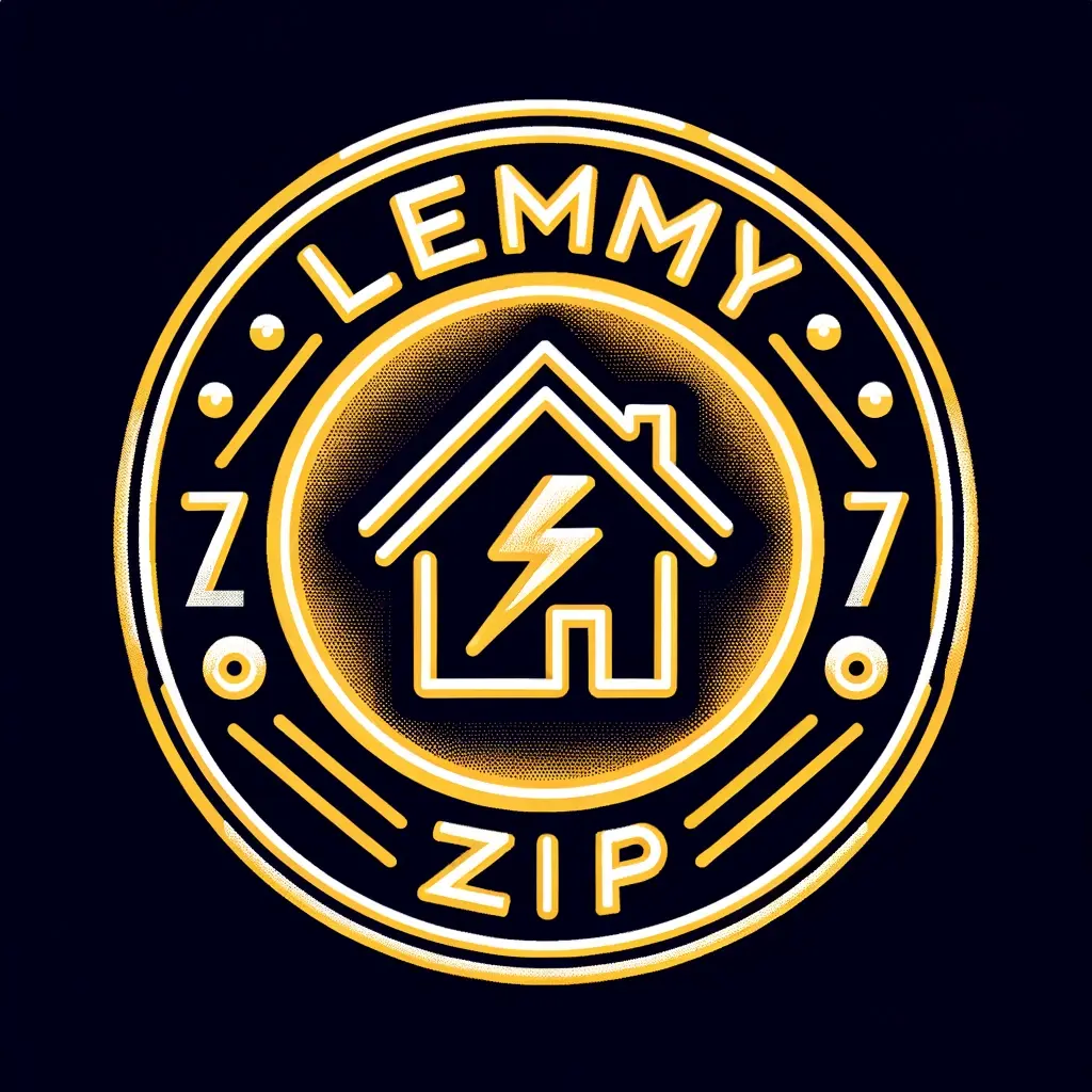
I liked OP’s design, and i have a little bit of experience with illustrator (or in my case, affinity designer) so i made a high res version of OP’s original, and also some other versions with some changes which might help.
Sorry OP, I cant remember how to do patterned strokes so the zip is a little off, but i tried to be as close to yours as I could.


Icon is up - i’ve used the bottom one, might try changing them out
Oh good, is that why the server went down? I was worried I crashed it by uploading 3 images. Again, very new to lemmy and the fediverse.
Anyway, thanks for using my icon! If you need any changes I can have a look at it again tomorrow.
Man those ones are awesome!
Second one is my favorite, it comes closest to my idea that the left eye is the zipper thingy.
Cheers! And same to you, I like the design.
I’m not really that creative, just good at making high res stuff since it used to be my job
The problem is that I am really bad at “graphics design” lol. I doubt that Photoshop is really meant to make stuff like this. Someone would probably have to recreate for it to look good. I tried my best to do it in Photoshop but it is still meh:
Spoiler

I definitely started to small with the image, that’s why it’s so blurry. Anyway, last “improvement”:
Spoiler

These both look great, in my opinion. Hopefully the admins agree. I’d love to see this as the instance icon.
For whatever it’s worth, I think it looks cool!
Thank you!
Or maybe even something like this?
Spoiler

I don’t think the zip part will be visible at an icon scale. Ig if it helps, you could try to view the icon at like 5% or less while you’re making it
I guess you are right
Oh I forgot to mention that tools like Illustrator and Inkscape are better tools for stuff that needs to be scaled into various sizes (like logos).
If you want a more in depth explanation, Photoshop and Gimp specializes in rasterised images (images made of pixels) whereas Illustrator and Inkscape specializes in vector images (images made of graphs). When you scale up or down a rasterized image, the detail changes along with it because you see bigger or smaller pixels. When you do the same with a vector image, the math stays the same; the quality stays sharp as a result.
Disclaimer: I’m no expert in this field and am only providing this explanation from my personal experience.
Yeah I am a bit infamous in various groups I am involved with for always using tools for stuff they are not meant to be used for. When I get used to a tool and I am like “I can make something with this that is enough for what I need” it often wins over “there is a better tool for this task that I don’t know though I would need to spend time learning first”
I might need to take a look at programs for vector images though. Really frustrating when you try to move something around (like the little rectangles I made the zipper of) and they just turn into pixel mush.
GIMPy


