We’re Live! Gogogogo!
UPDATE: There may be pixel sync issues (the pixel timer not timing 100% right), still working ‘fine’. Reload the canvas if any issues occur.
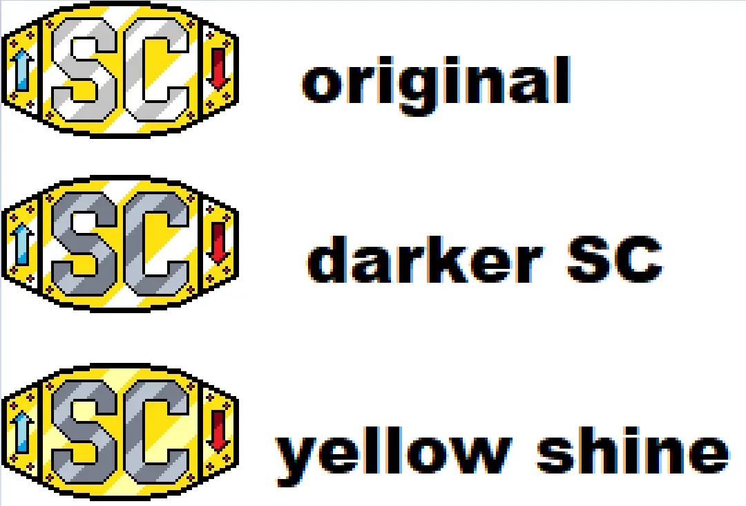
UPDATE: Border is in place, begin fil! Please use “Darker SC” colouring (the middle one)
Final Update We did it! The event is over and we made our mark! See you all next year to do it again!
It’s almost time!
Last year with the Reddit exodus, the folks over at Canvas set up the Fediverses own version of /r/place from Reddit. (If you aren’t familiar, it’s that pixel placing game where you make weird collaborative art!)
This year’s (the 2nd annual) Canvas will be going live this Friday morning. The url also shows a countdown to it’s start to help keep track)
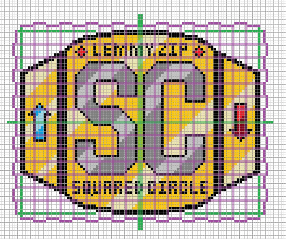
siv9939 has designed a great piece of pixel art for us to go for:

The design isn’t too big, should be easy to locate, and shouldn’t be too hard for us to map out and maintain!
PLACEMENT:
We can move things if need be, but for a starting place I feel we should avoid edges/corners/the dead center. People will hit those areas quick. For now (unless if you all say otherwise) I’m gonna place us south-east of center since it should give a lot of clearance. The template above should reflect this.
For calibration - This jewel’s (the one to the upper-left of the S) red centerpoint https://imgur.com/a/kknUZJE is at co-ordinates 364, 328. Whoever starts off the first few pixels tonight I highly recommend start here and everyone focus outwards. Should something happen and we need to change locations, post below so we can co-ordinate.
The map unlocks Midnight, Friday Morning and is open for anyone with an account on the Fediverse (not just Lemmy users). Anyone who wishes to work on it can feel free, exact placement will be decided within the next day, if you know that you’ll be online with the intent of helping, please chime in so we know! (or if you just plan to pop in now and then too!)
Our own home instance Lemmy.zip is also doing a piece for the server as a whole, so feel free to join in on that should you have extra time and want a second one to work with!
siv’s design
Nice job, siv!
I’m glad people seem to like the design. It looks like Canvas has sharable templates in case you want to see the design in relation to the whole thing. It doesn’t need to stay in that corner, I just threw it there since no one had claimed it yet in the discussion thread over there.
Don’t mind the placement, but we can adjust if needed, plus it’ll expand outwards so we’ll get more space as it does. Size wise, seeing it now in the context of the whole thing, I think this will work out well.
i’m reddit dumb and have no idea how this works but i’ll be there in spirit :)
It’s painting by clicking 1 pixel at a time (well, up to 6 at a time, they regen 1 every 30 secs and stack up to 6). Just follow the pattern and replicate the image basically. The template link will overlay the logo we’re going for ontop of where it is (and you can lower the transparency on it to see through it) and from there it’s just paint-by-numbers (and eventually stopping someone from drawing overtop of ours if it happens but people are nicer here lmao)
ooh i think i got it! my instance is doing something like this too with our cute blahaj mascot :3
Honestly I’m not 100% sure how it works either. I’m thinking all you’ll need to do is click the template link once things are going to place down pixels, but if not I’ll be panic clicking around in about an hour.
Edit: There is a login. It asks for your home instance, then your username. Then you get sent a code to sign in with. Fairly painless as long as you’re patient and don’t close the screen you put the code in.

Outlines are coming along a good bit!
I’m back and don’t have much I need to do today. I also just found a pixel that’s red on the template but should be black. Oops :P
Bahah :P
As for the other colour variants you posted last night/this morning, I couldn’t really see em (they were stuck as thumbnails) so i avoided colouring anything in till you were up lol.
It’s less they’re stuck as thumbnails and more I posted them at 1:1 because people actually seeing the changes didn’t cross my mind in the middle of the night. Here’s a bigger version of all 3.
Oh lol fair enough :P
Good timing as well since it’s decision time.
I like em all…darker SC may be better than original for visibility with all the white around, yellow shine would be easy to transition to from there as well if we wanted. Your thoughts?
We could do the darker parts of the SC and yellow background first, then fill in the shines if we have time.
Works for me!
Edit: If nothing else, this whole experience has assisted with getting me to learn how to use Matrix lmao
I like the placement. I did see talk that the My Little Pony design was flipped to avoid running into osu! but I haven’t seen where osu! is going to be. Looking at the playback of last year’s the osu! design got put down pretty quick, so it shouldn’t take too long to find out where they’ll be. I’ll be on at midnight to help get us started and I’ll keep an eye out for a giant pink ball. A planned back up location could be the opposite corner of the Ponies.
Apparently where I chose encroaches on OSU’s so I adjusted it down a bit. Someone is putting together a mock-up to show placement https://lemmy.zip/post/18937639?scrollToComments=true
I just saw that too and was ready to move us out of the way, then I saw you were already on it lol.
Bahah XD
A planned back up location could be the opposite corner of the Ponies.
Good idea
Just over 24 hours in and we have the original design done!

Personally, I’m ok with Nimona overlapping with us for those three pixels, especially since they’re using the dark red so it’s not too noticeable and they haven’t pressed in any further. If everyone else is fine with it I say we leave them be.
Filling in the the lighter parts shouldn’t take long, then we can sit back and make sure no one draws a dick over it or something. Here’s a new template if anyone wants one with the new filled in parts.
Looks amazing! Well done!
Yours as well!
I shall begin my watch!
Huzzah!
we can sit back and make sure no one draws a dick over it or something
Well, there goes my idea… /s
The canvas got expanded, lots of space for dicks!
I’ll pass on the opportunity for a glorious “yo’ mama” joke. But I’ll still point out the opportunity.
Well, my mom did have a lot of space for dicks but that’s a different convo lol
Bro, 3 different dudes introduced themselves to me at my mom’s funeral as her “boyfriend”. And me being the turd that I
amwas, I tried at every opportunity to get them to talk to each other that day.Bahah. My mom introduced me to 4-5 different men as my father. While she was getting under-the-table child support from my father. Who I did know about. She was not a smart woman, thank fuck she’s goddamned dead.
And I thought not knowing about my half sister until my mom was on her death bed was bad. Maybe we should switch our focus from wrestling to having dead moms.
Not sure if there would be any interest, but things have been going pretty smooth so I made 2 slightly palette swapped versions of the design. The first one I made the grey in the SC darker and used light grey for the shiny parts. The second one I did the same for the yellow. I’m getting ready to tag out, so I’ll let people that aren’t tired make the call if we switch. I mostly did them to have something to do while waiting for my pixels to refill.


I’m here now, s’all good! Just waiting for my code to login.
Edit: Going slow, but steady and no issues yet!
I’ve been watching the progress, and I’ve got to say I’m impressed. I want to contribute, but I keep having log in issues on my phone, while trying to visit canvas on desktop just gives 502 errors. (Probably due to the tons of privacy/ad blocking addons I’m running and refuse to disable) but if I do eventually get in, I’ll do my part. o7
Update: Finally managed to login, been helping fill in the light gray throughout the day.
Like Montagge said, was canvas’s problem. Was in their matrix most of yesterday afternoon, things kept getting hugged to death lmao
Had the same issues off and on! I think it’s canvas itself that’s the issue!
Shit’s been up and down half the morning, so not as much progress done this morning as I’d have liked, but we’re getting there and got plenty of time!
It was kind of janky last night, but I just thought it was tied to them expanding the canvas.
More ‘the admin needs the constantly monitor for overload and went he goes to bed it takes a dump lol’
Per the admin in their Matrix chat, Canvas is being temp. paused to work on issues, event will be extended.

Edit: https://feddit.org/pictrs/image/ec720f0e-7149-43ba-bb1a-a556cff0d81b.png Where we ended before shit went boom.
Edit 2: We may be ready to go again shortly!
It was either gonna be that, or big show/lesnar breaking the ring, and I’m glad it was lmao
Updated above with some placement updates and a starting plan. Also posted the template and logo placement on the canvas discussion thread to see if any extra movement changes need to be worked on.
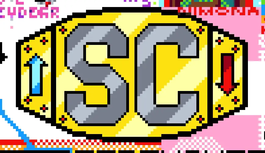
Just finished filling in the pastel yellow. And with that, we’re all done!
Now we’re all on wiener watch!
Hoor–wait wiener watch? lmao
Making sure no one draws a dick over it. lol
Oh, duh, right lol
Nice. Now I’ll need to find something else to keep me from going to bed at a reasonable time.
If that’s you’re goal, I suggest getting an overnight job. You’ll never have a stable sleep schedule again!
*shudders in PTSD from one of his 2846 call centre jobs which was midnight-8am*
I’ve been working on the rainbow mortar pixels lmao (which is what I primarily worked on last year).
I’ve been helping fill in the trans flag behind us, although now that the river is to us I might try to put a tug boat on it.
I’ve been extending the river lmao
I was checking out what other groups are planning and it looks like we’re on the bigger side design-wise. New Zealand is going big too and has similar user numbers as us so maybe we’ll be good. I did go ahead and lighten up the design so the reflections are white so we don’t need to fill them in. Here’s a template with the new version. Also might not be a bad idea to start off focused on the center plate and add the side plates later if we have time.
Good thinking all around, the white will help cut down time a good bit. Same with the center plate, can make the starting point one of the red jewels for visual clarity, build outwards to fill in the plate, then work on the sides after when we’re in a good spot. If all goes to hell and we get pressed for room, or have to move elsewhere on the canvas, we can focus on just the center plate and dump the sides. Barring any other changes you can think of I’d be good to go with this one personally.
Only big thing left would be cementing placement, depending what the other peoples plans are over this next day or so as other communities keep chiming in.
Edit: Just saw the official Lemmy.zip canvas post and I’m a bit worried the size may end up being an issue. The starting canvas is half the size of last years, and this year it’s open to the Fediverse, not just Lemmy. Real estate may become a premium more than we are expecting.
As far as the logo goes I still love what you made, but if you’re up for it are you able to size it down a bit vertically? Keep it the same length and overall design, but shorten the height so it’s more belt like visually. The ‘lemmy.zip’ and ‘squaredcircle’ we could honestly probably drop off to save more room (or put in a matching pair of jewels if we wanna be fancy lol).
Here’s a shrunk down version. The overall footprint went from over 6500 pixels to 4300 exactly, and that’s including all the white we hopefully won’t need to put down. I’m not sure if it’s worth trying to claim an area over on the discussion thread since I don’t know when people would be able to start working on ours. I could probably be on as soon as it starts but if no one is there to help or keep it going when I go to bed we would probably be better off waiting until (east coast) morning.
Design: Fucking perfect!
With it starting midnight (Friday morning) ET, I can pretty much guarantee my own presence by as early as 3am ET with little interruptions onward, so if that helps. Usually some people around near that time as well from my timestamps so we may be in a good spot.
Looks like Canvas is back up and running and will be extended an extra 24 hours!
After defending against any and all dicks, this year’s Canvas is finished. Here’s a shot of us and our neighbors after the last pixels were down. Here’s to doing it again next year.

Absolutely! That belt took some work and that outer-double-line seemed so long ago lmao
